"Bigger Trees Nearer Warter," winter 2008, oil on 9 canvases (36" x 48" each), 108" x 144"

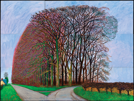
“Bigger Trees Nearer Warter,” winter 2008, oil on 9 canvases (36″ x 48″ each), 108″ x 144″

“David Hockney really has been one of the most influential British artists of his generation,” says Richard Benefield, deputy director of the Fine Arts Museums of San Francisco (the umbrella organization for the de Young Museum and Legion of Honor). “In fact, he is arguably one of the most influential artists of his generation, period, because, even though he’s continued to work in a figurative style, he’s been open to exploring every possible technology that’s come his way.” Hockney is also, like the artist he most cherishes, Picasso, incredibly prolific. For these reasons, the de Young’s “David Hockney: A Bigger Exhibition” (October 26, 2013 – January 20, 2014), which covers Hockney’s career over the past decade (2002 to the present), will be the museum’s largest show ever. It features over 300 works (some of which were drying even as the final show list was being created), sprawling out over 18,000 square feet, 12,000 of that being the museum’s regular temporary exhibition space and the final 4,000 in four upstairs galleries.

Born in Bradford, United Kingdom, in 1937, Hockney, who splits his time between the countryside of his native England and Los Angeles, began garnering an increasing attention for his work in the late 1950s. At that time, as Benefield–who is also co-curator of the exhibition, with Gregory Evans–notes, the work was rather intellectual and verged on abstract. However, Hockney’s art has always maintained a connection to the figurative and has always exhibited the artist’s talent for drawing, an activity he’s pursued since childhood. Indeed, at the foundation of all his work, even the artist himself claims, is drawing and line.

As Sarah Howgate, contemporary curator of London’s National Portrait Gallery, notes in one of the catalog essays for the exhibition, “Hockney has always made exquisite line drawings; he is widely recognized as one of the greatest draftsmen of the second half of the twentieth century.”

As much as Hockney is revered for his talent in the most traditional of art mediums and pursuits–in addition to drawing, Hockney works in oils on canvas, as well as acrylics and, new for this exhibition, watercolor–he also fully embraces whatever new technology he can get his hands on. Additionally, he has long had a penchant for creating multiples, one interest that links him to the Pop art scene in which many have placed him, albeit that remains a sticking point for some. (Benefield, for instance, finds this comparison erroneous: “I don’t think he ever was a Pop artist,” Benefield states. “He just happened to come to prominence during the period of Pop Art, and he was very friendly with a number of Pop artists.”)

To these ends, Hockney created lithographs in the 1960s and 1970s. “He loved making prints,” notes Benefield, “because that was a way to disseminate his pictures to a larger audience.” From there he moved on to faxing drawings, then to creating high-quality printouts on a color photocopier, employing each technology when it was new. He’s also worked with photography and in Photoshop and now continually works with iPhones, iPads, and digital cameras–the latter three featuring prominently in this show (and he regularly sends his digital sketches to friends immediately upon completion); in fact, he’s replaced his ever-present sketchbook with an iPhone. But then, Benefield points out, he always returns to drawing and painting.

"Woldgate Woods, 30 March–21 April," oil on 6 canvases (36" x 48" each), 72" x 144"

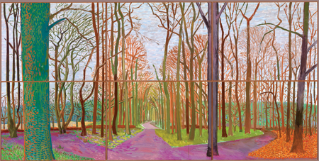
“Woldgate Woods, 30 March–21 April,” oil on 6 canvases (36″ x 48″ each), 72″ x 144″

Hockney also sticks with tradition when it comes to the genres he focuses on; he only partakes of the three most historical art genre: still life, landscape, and portraiture. The latter two being what this current exhibition features, with equal weight given to both. However, to Hockney, all of his work has a figurative quality, even when figures are absent.

Fittingly, this exhibition covers a large range of mediums: charcoal on paper, multi-camera films, iPhone and iPad drawings (both printed out and on-screen), oil on canvas, acrylic on canvas, watercolor, and more. Generally, the exhibition is grouped by subject matter and medium: it begins with portraits, moves into plein-air landscapes, then film, and so on. “The exhibition will express his fluidity, how he flows easily between mediums,” explains Krista Brugnara, the director of exhibitions for the Fine Arts Museums of San Francisco. And that is because of Hockney’s ability to make each of his chosen modes of expression his own. To that point, Benefield says, “I never like to use the word experiment with Hockney because there never really is an experiment; he sort of goes through a period of, take the iPad for instance, he’s figuring out what all he’s able to do with it, and then he just all of a sudden has mastered it, and he’s creating phenomenal work on itÉ He picks it up, learns how to use it, masters it, and then starts making art with it.”

In addition to the exhibition featuring numerous mediums and a huge amount of work, another standout feature is that several of the works presented are the largest Hockney has ever made: in several instances, a single piece takes up an entire gallery. For example, The Arrival of Spring in Woldgate, East Yorkshire in 2011 (Twenty Eleven), Version 3, 2011Ð2013, which comprises 32 oil on canvas paintings and 12 iPad drawings each printed on 4 sheets of paper; Brugnara notes that the viewer “will be surrounded by what that [the arrival of spring] means.” In another gallery there will be playing four 18-camera films–what Hockney calls his cubist films–one on each wall, of the same location in Hockney’s home area of Woldgate Woods. Each wall features a different season, with each of the 18 cameras providing a slightly different perspective of the landscape: the viewer is thus engulfed in the full spectrum of a year. Notably, the viewer being immersed is part of the piece, thus making these large works implicitly figurative.

In the upstairs galleries, viewers will experience some of Hockney’s most recent works as well as a few older pieces, which provide context for the rest of the exhibition. Being shown for the first time is The Great Wall, a huge (72 feet long and eight feet high) presentation of chronologically and geographically ordered images presenting the history of European portraiture from 1200 to 1900. The work is the result of exhaustive research into the subject, leading up to Hockney’s somewhat controversial book “Secret Knowledge,” which concludes that the Old Masters used optical devices to map their works. Some of Hockney’s photo collages will also be on view, these relating to the cubist films and the multi-canvas landscapes, all being studies in perspective.

So, with an exhibition so enormous, what’s the best approach for the viewer? “I think that people have to come to the exhibition with an open mind and clear their heads of what they remember of Hockney as swimming pool paintingsÉ and let themselves be surprised.” Benefield says. But, he adds, “Prepare to be a little overwhelmed.” He continues, “There’s so much to see in all of this work, the generosity of the artist himself just putting it all out there for you to take it in.” Perhaps the greatest gift Hockney is presenting, again and again, is providing us with a new way of seeing: from different angles, at different times, in different forms. As amply evidenced in this vast exhibition, he’s abundantly offering the opportunity to look at the world with fresh eyes.

Private collection of Oakland-based Fred Neal

Private collection of Oakland-based Fred Neal

Years before the Globe and Mail declared Oakland the “Brooklyn of the West,” in 2012, citing among other cultural draws its “exuberant art;” or before ArtPlace designated Oakland’s downtown neighborhood as one of America’s top 12 Art Places, earlier this year; or before the New York Times noted that Oakland’s first Friday art event, Art Murmur, was a key component of turning Oakland from “seedy to sizzling” in 2010, then in 2011 mentioned Murmur as a component of Oakland getting “a new ‘there'” and finally, last year, ran a full story about the event titled “A Monthly Night of Art Outgrows its Name”–years before all that, Fred Neal began building an art collection focused primarily on East Bay-based artists (in addition to a few artists from further afield in the Bay Area).

Today Fred Neal, an engineer by profession, holds “somewhere around 300 to 400 or so pieces of art,” as he stated in a recent interview. “I’m not sure though; I’ve never catalogued all of it.” Exact numbers aside, the collection contains more than enough to fill just about every inch of wall space in Neal’s modest Albany home (just north of Berkeley); “I rotate the work,” says Neal, “and I loan art out to family and friends.” In his designated art room, he keeps racks of stored works and a flat file case that is literally bursting with photographs and prints.

Prints, drawings, paintings, photographs, and wall sculpture hang throughout and sculpture sits beside the many pieces of his glass collection (procured from the region’s glassblowers). And Neal’s taste varies widely: there are abstracts and landscapes, colorful pieces and black-and-whites, traditional wood-block prints and images made with a scanner, funny works and serious pieces, Latino protest art, and work by both young up-and-comers and established artists. Among the numerous works hung salon-style in the family room are a bright, minimal abstraction by Mills College MFA graduate Brian Caraway; in a nearby hallway is one of Oakland-based artist Peter Foucault’s abstracts, the workings of a robot; and, in his office, is a large photograph of a decaying building by Katherine Westerhout, who is also based in Oakland.

When asked what guides his purchasing, Neal simply responds, “I buy what I like.” He also mentions that he keeps himself to a strict budget (most of the pieces were bought for under $1,000), and he buys work from young artists, early in their career. It’s a collecting style (and zeal) reminiscent of Herb and Dorothy Vogel.

Fred Neal started collecting art in the late 1970s; the first works he bought were prints by Northern California artists Stan Washburn (who’s now represented by ArtZone 461 in San Francisco) and Henry Evans, who focuses on botanical prints. These first pieces he purchased were from the now defunct Collector’s Gallery, which was in the Oakland Museum of California and run by Mary Ellen Landis, and featured all local artists. “Mary Ellen was the first,” notes Neal, “to show local artists exclusively.”

But it wasn’t until about 10 or 15 years ago that Neal started collecting in earnest; it was at that time that he really started to delve into the Oakland art scene, inspired by Kerri Johnson at, first, the Oakland Art Gallery (OAG), then (the now closed) blankspace (also in Oakland); “It was Kerri who really got me hooked on the Oakland art scene,” says Neal. “I collected heavily from her.” (Johnson, an artist herself, is now co-director of Branch Gallery, Oakland, and a founding partner of the Bay Area Visual Art Network, BayVAN). Another space Neal frequented then and still does to this day is the long-running Pro Arts (which joined forces with OAG in 2009).

“There were,” Neal says, thinking back a decade or so, “many smaller galleries in Oakland that came and went. And then about six years ago, a lot of artists started to migrate to Oakland, especially from San Francisco, and more galleries started to open up.” Neal pursued the growing scene, becoming familiar with and buying from galleries such as Rowan Morrison (which is now defunct), Johansson Projects, Chandra Cerrito Contemporary, Swarm, Krowswork, and artist co-op Mercury 21, and a few years later, Vessel Gallery and Slate Contemporary. “I also want to mention the Compound Gallery, with Mat and Lena Reynoso,” Neal continues. “Three or four years ago, they took a large warehouse building, and they now have a beautiful gallery space and studios for at least a dozen artists; they’re also artists themselves. It’s a great place to see art and meet artists, and it’s just fun to hang out.”

Neal goes on to add, “Oakland also has great Latino art; I collect Jesus Barraza, Favianna Rodriguez, Melanie Cervantes–they all started a print collective here for political and activist art. I first saw this work at Pro Arts and got hooked.”

Within his collection, Neal has work from over 100 artists–including, to mention just a few, Hunter Mack, John Vias, Ann Weber, Misako Inaoka, Deth P. Sun, Jon Carling; “I have a lot of favorites,” says Neal–and a list of artists he wants to collect from, most of whom live nearby. When asked why he sticks close to home, he notes his interest in getting to know the artists; not only are there numerous galleries where he can find work but also loads of studios to visit.

And, finally, when asked, “why Oakland?” Neal explains, “Oakland has a vibe. It’s gritty and down to earth. There’s a lot of diversity and it’s unrestrictive. Oakland is fun and edgy, and these kids are doing different things. People are more adventuresome, taking more risks with their work. And they’re getting it shown here.”

"Untitled (20A)," 2012, oil on cotton and pencil on canvas, oil on wood, 50" x 45"

“Untitled (20A),” 2012, oil on cotton and pencil on canvas, oil on wood, 50″ x 45″

From his earliest forays into the world of visual art, Jordan Kantor has inextricably linked art-making and art history. This dual interest has led Kantor down a path of academic rigor, curatorial studies, art teaching, and art writing–all of which informs Kantor’s strongest passion: being an artist. While still in high school, he started taking art history courses at the local university (Princeton). From there, Kantor went on earn a degree in painting at Stanford, where he developed, as a thesis project, an exhibition of prints by Albrecht Durer: “It was not so much a scholarly thing,” explains Kantor, “but more from a practical perspective, of my own interest in reproductive mediums, narratives, across a certain set of artworks.”

Kantor later pitched the thesis exhibition to Harvard, which led to a three-year curatorial project, and to Kantor earning his PhD there, in the history of art and architecture. Meanwhile, he also began to build a name for himself as an artist, having shows in New York, where he was living. “One of my goals was to get out of the studio and not just be in my own head,” he explains. “I was introduced to some people at Artforum magazine, and I decided I wanted to write reviews, in the tradition of artists who wrote, such as Donald Judd–who found a way to work out problems in their artistic practice through a writing practice.” He began writing regularly for Artforum, and to this day continues to publish articles on contemporary art. Kantor also further engaged in curatorial pursuits, working for two years as an assistant curator at MOMA. But his primary interest remained art making, so when the opportunity arose to move to San Francisco to teach at CCA and return to a full-time studio practice, Kantor made the move.

Over the last decade, Kantor has focused on creating work that layers art-historical references, among them works such as Manet’s A Bar at the Folies-Bergere, and Monet’s Les Mueles, for instance; and reproduction, be it photography, digital Internet imagery, or X-rays; along with various stylistic allusions, from the minimalist grid and monochromatic color to the pared-down approach of Luc Tuymans, mixing them all together with an acute awareness of the object-hood of art. In recognition of his practice, in 2008, he received a SECA award from SFMOMA and was included in the 2008 California Biennial, at OCMA.

Given the vast and multifaceted background Kantor pulls from, the resulting body of work may appear incongruous to an unsuspecting viewer. “You might walk into a show of mine,” Kantor states, “and it might look like a group show, with works with so many different approaches and aesthetics. That’s because the unitary element of my practice isn’t aesthetics, it’s concepts.” One consequence of his art being so steeped in concept and the art world dialogue is that the work, by Kantor’s own admission, has required some background knowledge to be fully understood and appreciated. This is something the artist is veering away from in his current work, which explores the artistic value of materials and objects surrounding the art-making process; can, for instance, the rags used to wipe his paintings be configured into artwork in their own right?

For his recent solo show at Ratio 3 in San Francisco (January 11 through February 9), then, Kantor crafted “a large group, at least ten, of the rag paintings, in four-color, hand-painted artist frames,” he says. Additionally, he crafted “a suite of ten small representational paintings based on photographs of a woman’s hand in front of differently colored monochromatic fabric and a small group of large abstract works painted on wooden lattice.”

“Now the work is what it is,” he explains, “a display of materials. If you want to pick at it, you can tease out the thoughts that come from art history, but I don’t see that as being a prerequisite to having access to my work. It’s an open-ended process. I’m more interested in asking questions than arriving at answers.” This act of creating a dialogue strikes to the heart of what has driven Kantor since the beginning: “I see the whole process of being an artist as a way of engaging in a conversation across time,” he says, “sometimes with historical figures and sometimes with my peers and sometimes with people I don’t even know.”

Driss Ouadahi, "Breakthrough," 2012, oil on canvas, 78 3/4" x 141 3/4"

Driss Ouadahi, “Breakthrough,” 2012, oil on canvas, 78 3/4″ x 141 3/4″

“Look Both Ways”  features 31 works by 20 artists, including a large installation, several sizable sculptures and wall-works, as well as a number of moderately sized works. It also introduces Hosfelt Gallery’s grand new space — a light-filled, high-ceilinged, industrial-raw space encompassing 8,900 square feet — in the Potrero Hill area of San Francisco. The exhibition is a sampling of highlights from an illustrious stable artists: Alan Rath, Jay DeFeo, Tim Hawkinson, and Jim Campbell among them. And not only does it celebrate what’s transpired over the gallery’s 15-year history but also, with the introduction of several new artists as well as new work by long-standing artists, looks forward.

One highlight of the show is that several of the larger works – including Liliana Porter’s installation “Man with Axe,” the mechanized sculpture “Lala Zaza” by Rath, and Hawkinson’s whimsical “The Fin Within” – are to their benefit provided ample room to breathe in the expansive gallery space. And while there are works in a number of different mediums — mechanical sculpture, paintings, drawings, photography — and varied formal orientations — bright, subdued, detailed, minimal, organic, reflective — it all manages to hang together, a nod to good curating.

On the note of curating, and further addressing the space of the gallery, one of the stated goals of the exhibition is to present “work that exists on one level when seen from a distance, but that is something else up close.” There are several instances where this is particularly evident, one of which is Campbell’s light sculpture “Tilted View.” From afar, it’s a suspended plane of small, white globes, with shadows of what could be overhead clouds creating subtly greyed areas that float across their surface. Step in closer and the orbs break down into their individual units, each one hanging from a black wire. The illusion of the changing skycap is, it turns out, programmed patterns of light fed into small bulbs. The image has been pixilated, albeit it is no less lyrical for knowing that.

Emil Lukas’s elaborate wall-hung “Horizontal Ring” reads at a distance as a colorful abstract image that shifts as you move around it. The fine and innumerable pieces of thread that comprise the piece become evident as you get closer; they are strung from nails tacked into the sides of the frame, akin to the string art we were all introduced to in childhood, though taken to a whole new level of intricacy and layering. The effects are delightfully dizzying and dynamic.

Also by design, another common thread here is an emphasis on a visual hook to draw us in only to slowly reveal a greater depth. While the works throughout the show are consistently engaging, there are a few that stand out, particularly in this regard.

The breathtaking oil-on-canvas diptych “Breakthrough,” by Driss Ouadahi, features a broken chain-link fence with only sky behind it, here a purple and yellow sunset. This photorealistic work makes an immediate impact: it’s expansive, all-encompassing, and gorgeous. Sit with it for awhile and thoughts of imprisonment, escape, longing, and “it’s better on the other side” readily come to mind; then the patterns of the fence take on a meditative quality, disrupted by the snared imperfections.

While it’s easy to get wrapped up in the presence of the grander works, there are a number of modestly scaled pieces that hold their own: lively and colorful ink-and-acrylic on paper works by Rina Banerjee, simple yet poignant collages by John O’Reilly, and delicate monochromatic watercolors by Nicole P. Fein. It adds up to a celebration of thoughtful, complex work and a tantalizing foreshadowing of things to come.

Robert Minervini, "A Necessary Ruin," acrylic on canvas, 50 x 60"

Imagined, futuristic landscapes are the common theme that runs through the work of artists Tadashi Moriyama and Robert Minervini. But that is where the commonalities end, providing an opportunity to delight in very different, but equally engaging views of the world we’re headed toward. (It’s a theme that’s been featured prominently in other recent shows in the Bay Area, specifically those of Amy Casey and also of Alex Lukas.)

Minervini’s world is post-apocalyptic: shells of finely rendered, multi-story buildings hold court over an otherwise structure-less landscape that is filled only with shrubs, grasses and marshland. Trees are noticeably and suspiciously absent. Luminous multihued skies — oranges and pinks, blues and yellows — place the scenes at the beginning or end of the day, a visual metaphor for the larger “end of days” message. But these works are more hopeful than full of doom; they are very sparsely populated with humanity, small flowers are in bloom. The tone is of rebuilding and regeneration. These structures are new, as indicated by the presence of a crane in one work, placed far in the distance, and the fact that they are whole and show no signs of wear.

Moriyama’s world, comparatively cartoon-like, primary-color bright, and fantastical, features intricately networked communities or cities that appear to be controlled by a single or just a few, central figure-head(s). The big brother/government-oversight message is clear. Nature and technology appear as if enmeshed, equally holding things together and pulling them apart.

If Minervini is reflecting on what a recovering world will look like after a catastrophe and Moriyama is providing us a view of a future without one, neither world is exactly a view of paradise. The elements and themes here actually don’t veer far from today’s world: the future may be closer than we think.

Alice Shaw, "Curtain Call," 2012, Pigment print on canvas, 43'' x 78''

Conceptual artist Alice Shaw gracefully balances humor and serious commentary—here, global warming and pollution—in her fifth solo exhibition at Gallery 16 (through April 21). Employing photography, sculpture, canvas, and/or paint, Shaw wittily, slyly, pointedly relays her thoughts and observations about the deteriorating state of our surroundings.

Some works hit like one-liners, such as Evidence of Global Warming—Former Goldfish Habitat (2012), a fish bowl filled partway with sand with a piece of driftwood sticking out of it. Others reveal in layers, such as Some Things Change and Some Things Stay the Same (2011), a photo of trees in a forest; at center are trees whose leaves are changing, surrounded by evergreens. Also subtle, and cheeky, is Panorama (2012), which at first appears to be only a raw canvas; closer inspection reveals a forest landscape painted along the sides, just brushy enough to deliver the image, just quiet enough to not be obvious.

Throughout this large show (there are a total of 26 pieces) of generally smaller works (most pieces measure in the range of 10-by-13 inches), we are, one work after another, compelled to stop, look, smile, and think. Shaw’s unique vision and clever perspective, an enduring pleasure in all her work, is once again superbly translated into objects, of art.

Gottfried Helnwein, 2011, "Child Dreams 6," 94.5 x 172"

Seven arresting, large-to-enormous paintings are presented in this solo show (up through February 25, 2012), another in a long line of powerful exhibitions, by painter, photographer, costume and stage designer, and performance artist Gottfried Helnwein (this is the artist’s 15th exhibition at Modernism). Raised in Vienna, Austria, during the troubled years following World War II, Helnwein has focused his career on using art as a means of confrontation: “I felt I could strike back with my pictures and force people to look at things they’d rather forget,” he says in an essay by Robert Flynn Johnson. In this strategy—though less direct—of creating unforgettable politically and socially critical work—and specifically regarding the connection of focusing on the Nazis—there are links between Helnwein and Belgian painter Luc Tuymans. A primary focus of the artist, which is the case with this show, is portraying young girls who have been victimized or are otherwise in danger; the mood is foreboding. The photorealistic canvases—Helnwein’s skill is impeccable—of often larger-than-life subjects make the impact all the more intense. And while his images are often disturbing—his work has been vandalized more than once over the years—they are never repulsive; the works balance horror with beauty, providing a successful vehicle that plays straight to the artist’s intent: we stop and look and think about it.

This current exhibition, featuring work from a new body of work, “The Dreams,” was inspired by the sets and costumes Helnwein created for “The Child Dreams,” a play by the late Israeli playwright Hanoch Levin. Several of the works feature girls (or a girl) wrapped in white bandages and wearing a flowing white dress, floating/falling through an undefined red/black space; the dreaminess, mysteriousness, of the works is a departure from the past, but no less enthralling. The most captivating of these is the huge (94 1/2 x 172 inches) The Child Dreams 6(2011), which features over twenty of the girl figures, lit from above and center by an unknown source, in various poses and at varying degrees depth—some almost fade away, appearing as ghostly beings retreating into the darkness, while others are well defined. The work evokes both a fear of helplessly falling into the abyss, which is compounded by a fear of violence, implicated by the bandages, as well as poetic freedom, as the figures almost blissfully move through space, ballerina-like. Once again, Helnwein has us just where he wants us.

"Bricks (Budapest)," by Tamas Dezso, 2009

Isolation, bleakness, and decay have a strong presence in this solo exhibition (up through November 23, 2011) of photographs by Hungarian artist and photo-journalist (he’s been published in Time, the New York Times, and National Geographic, among other publications) Tamas Dezso. But while the tone may be dour, the serene poetry of these works leaves one feeling more dreamy than depressed.

The works on exhibit (2009–2011) are all part of the series “Here, Anywhere” (recently awarded first place at the 2011 International Center Awards and the Daylight Magazine and Center for Documentary Studies Project Prize), which documents Hungary’s “vanishing past”—the edges of Hungarian culture that are being lost to post-communist-era changes.

These images, then, serve as poignant and powerful documentation of a culture experiencing profound transition as well as formally conscious works of art. As regards the latter point, these pieces capture moments of rhythmic chaos and juxtaposed textures—a flock of black birds flying above leafless trees against a grey sky; a man atop a huge pile of white bricks in front of a large brick wall; a field of dying sunflowers. These are moments of quiet, and are both arresting and contemplative.

David Jang, "Proliferate"

The common feature that runs through the recent solo exhibition (up through September 30, 2011) of work by Los Angeles–based artist David Jang is repurposed material, which the artist has used to create a small installation piece, a wall sculpture, and two-dimensional pieces. What is most refreshing is Jang’s creative refiguring of his chosen mediums and objects; their original purpose or configuration is not immediately evident. More to that point, the work isn’t reliant on this eco-trend; it’s not defined by the recycling, only provided with greater depth. Two pieces in particular are exemplary in this regard: Novelty and Proliferate. The former is a sculpture that comprises seven variously sized Hydrangea-like, half-sphere silver forms—created with inside-out chip bags. Taken at face value, the piece bursts with shiny complexity—the organic shape juxtaposed with the man-made metallic sheen. Factoring in the material as chip bags adds an element of festivity or community (one can imagine a party of chip eating to provide the artist with the needed materials; the tight gathering together of the bags also contributes to this idea of community). Much quieter, Proliferate is a long off-white/yellowish ribbon-like piece that snakes back and forth in loopy zigzags, standing up on its thin edge; for this work, Jang covered a roll of paper towels in resin. Simple, beautiful, and moveable. Several other works in the exhibition are made from large pieces of wood, covered, at least partially, with a layer of deconstructed/flattened soda cans, with circles repeatedly etched into the surface. These rough, heavily textured works—and explorations of form, pattern, and composition—speak to the artist’s interest in portraying the cyclical nature of being, of life, and repetition (not only does Jang use the same shape over and over, but his use of multiple iterations of the same types of objects in one piece—cans, bags, etc.—also addresses mass consumption and throwaway culture). The rusty patina, while adding subtle color, also speaks to progression, aging, and renewal (these cans are experiencing a new beginning as an artwork). While repurposing materials and formal explorations aren’t groundbreaking endeavors, Jang brings, especially to the former, a unique, playful aesthetic worthy of thoughtful contemplation.

Julie Heffernan, "Picking up the Pieces," oil on canvas, 72 x 54 inches, 2010, courtesy Catharine Clark Gallery

Full disclosure: I knew this show would be good before I viewed it. Not to say I didn’t give it a critical look-over, but rather, given Julie Heffernan’s track record, some preliminary jpgs, and reception of work from the same series that showed last year  in New York (at PPOW; the current show, on view through October 29, 2011, includes newer works), it was clear to me that this Brooklyn-based painter had another hit on her hands.

Heffernan’s work here, as in the past, is richly detailed and brilliantly colored—a riot of reds, oranges, yellows, and greens pervade. They reflect the artist’s lyrical talent with the medium along with her beautiful imagination. Heffernan is able to deftly relay unique, fairy tale–like visions of her world. These works are autobiographical and strongly rooted in art history. The visually luscious Old Master style riffs off traditional still live symbolism—a pile of dead birds sit upon a central female figure’s lap in “Self-Portrait with Talking Stones” (2011) for example. These symbols of abundance, feast and nourishment are presented and brought into the present with a good dose of surrealist dreaminess. Variously, rocks float in the air; a figure wears a headdress of fruit; the ground is folded up like a bundle of cloth.

Akin to Heffernan’s earlier work, these paintings feature a singular, centrally placed figure. But whereas before the figure was always female (and a self-portrait), several of these new works feature a young man who, it turns out, is her son. The back-story: Heffernan’s son is leaving for college. In one painting, “Picking Up the Pieces” (2010), this central figure has on his back a huge bundle collected into a rope net; around his waist is a tool belt stuffed full. The symbolism is clear—he leaves with baggage but also the tools to deal with the challenges ahead (off to the side there is also a rock and next to it a sign that reads “Hard Place”). In another work, “Self-Portrait with Falling Sky” (2011), Heffernan contemplates her new state of uncertainty: rocks hover and float around the central female figure, none of them, however, touching her. Her world is up in the air, but there is the sense that it’ll all work out right.

Heffernan’s works not only feature the overarching symbols, surroundings, and objects that speak to the storyline the main character is engaged in, but also comprise numerous vignettes that may or may not seamlessly gel with the larger narrative. They’re tangential offshoots or breaks that keep us on our toes—and sometimes they are so well integrated in the visual abundance of the work, they may not get noticed until a second, third, or fourth look. Many of these scenes or images are inspired by NPR, which Heffernan listens to almost constantly, providing a topical twist to the work, which, because the origin is a mass-media source, might well resonate with that audience.

All but one (a limited edition print) among the thirteen works are oil on canvas, and mostly large in size. As a group they embody a visually complex and stunningly rendered timeless tale of the human condition that continues to reveal fresh details over time.