Marcel Dzama, "Here's a Fine Revolution," color spit bite aquatint, with aquatint and soft ground etching, 21 1/2" x 30 3/4", 2015

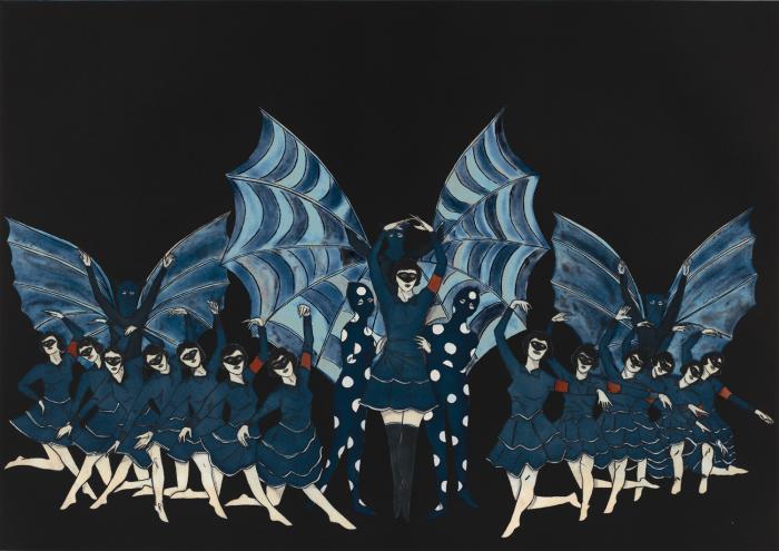
Marcel Dzama, “Here’s a Fine Revolution,” color spit bite aquatint, with aquatint and soft ground etching, 21 1/2″ x 30 3/4″, 2015

Having taken a week off for the holiday, Art Beat Bay Area returns with this weeks picks of some of the Bay Area’s amazing art offerings, as well as a look at what’s to come.

Marcel Dzama at Crown Point Press, San Francisco (through Jan. 2): In his signature darkly humorous and playful style, Dzama explores fairy tales, ballet, and terrorism, among other topics, in this show featuring three new prints, a series of twelve etchings collectively titled “The Fallen Fables,” a selection of black-and-white collages, and three films. There is also a short video documenting Dzama’s time at Crown Point Press that gives insight into the work and the artist’s process. Dzama continues to work in his highly recognizable and much beloved aesthetic (one writer referred to his popularity as “Dzama-mania”), and the work features characters viewers have become familiar with from past pieces; his art readily invokes thoughts of that by Henry Darger. When stopping in to view the work, be sure to pick up the Crown Point Press newsletter, Overview, which features an informative essay about the work written by Kathan Brown.

“The Mapmaker’s Dream” at Haines Gallery, San Francisco (through Dec. 23): This excellent group show features work by Maurizio Anzeri, Marius Bercea, Linda Conner, Chris McCaw, and Pae White. The works all address, as the show title directly states, ideas around mapping. By example, Anzeri sews geometric shapes onto vintage landscape photographs, invoking ideas of very simple architectural plans, what future structures over that space might look like. White’s video Dying Oak/Elephant is features digital animation created from the scanning of an 800-year old Oak tree, which resides on the For-Site property in Grass Valley; the artist created the video during her residency there. The resulting piece is mesmerizing and fluid; it has the appearance of traveling through the human circulatory system, flowing through a network of interconnected vein-like structures that ebb and flow in their density, sometimes breaking apart into a collection of dots. Throughout, this well-curated show is a thoughtful, engaging, and  thoroughly enjoyable.

Frida Kahlo, "Retrato de Mrs. Jean Wright, oil on canvas, 25" x 18", 1931, featured at the John Berggruen Gallery

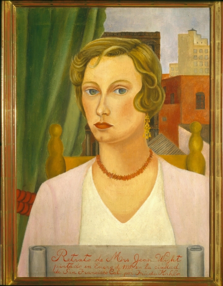
Frida Kahlo, “Retrato de Mrs. Jean Wright, oil on canvas, 25″ x 18”, 1931, featured at the John Berggruen Gallery

“Looking Back: 45 Years” at John Berggruen, San Francisco (through Dec. 19): This show firmly establishes why the John Berggruen Gallery has been considered one of the finest modern masters galleries around, especially when it comes to the work of Northern California artists, and more specifically, those from the Bay Area Figurative movement including Richard Diebenkorn, David Park, and Nathan Oliveira. Works by these artists as well as that by such well-known names as Frieda Kahlo, Georgia O’Keeffe, Clyfford Still, Wayne Thiebaud, and Ed Ruscha, among others, cover the two floors that comprise the gallery. It is an exceptional, not to miss show. The timing of a gallery retrospective is fitting as this is the gallery’s second-to-last show in its downtown location; an announcement of where the gallery is moving to will be made in the coming weeks.

Guy Diehl , “A Dialogue with Tradition II,” at Dolby Chadwick Gallery, San Francisco (through Dec. 5): Guy Diehl continues his decades-long career of exploring the traditional genre of still life. Once again, he delivers a show of exquisitely painted, moody and graceful works variously featuring books, bottles, and fruit, among other objects. References to art history, both direct and indirect, abound. This is a excellent opportunity to view exceptionally well painted and beautiful pieces.

Upcoming!

Thursday, December 3 is First Thursdays in San Francisco.

Opening December 4, Oakland: Erik Parra, “each devil his own,” at Transmission Gallery. An opening reception will take place Thursday, December 4, 6 to 9 p.m.

December 12, 5 to 7 p.m., Oakland: Open Studios and Group Show, “Something for Everyone,” at Lost & Foundry Studios, 305 Center Street, Oakland. Featured artists include Alexis Arnold, Jeff Hantman, Bridget May, Chris McNally, Kim Miskowicz, Mansur Nurullah, Pamela Palma, Steve Smith, Chris Wells, and Erik Zo.

The Panama Pacific International Exhibition, San Francisco, 1915

Just nine short years after the devastatingly destructive 1906 earthquake and subsequent fires, the citizens of San Francisco transformed the marshy wetlands of what is now the city’s prestigious Marina district, which had then been serving as a post-earthquake refugee camp, into the spectacular 1915 Panama-Pacific International Exposition (PPIE), a world’s fair to commemorate the opening of the Panama Canal. The feat was nothing short of miraculous.

The event featured 11 exhibition palaces over 635 acres, with 21 countries represented (in addition to national and more local representation). Central to the efforts of the fair was the showcasing of art. PPIE boasted one of the largest art exhibitions ever assembled in the United States: on show in the Bernard Maybeck–designed Palace of Fine Arts and an accompanying Annex were over 11,000 works of art (11,403, to be exact)—paintings, sculpture, prints, and photographs, all beautifully presented, as was discovered by the curatorial staff at the de Young when researching their upcoming exhibition celebrating the 100th anniversary of the PPIE. “We were excited to discover several previously unknown installation views of the Palace of Fine Arts,” says James A. Ganz, the de Young show’s curator. “There has always been an assumption that the Palace was a jumbled mess, but these photographs by Gabriel Moulin reveal beautifully installed galleries.”

Additionally, there were numerous murals and 1,500 sculptures commissioned by artists from around the world, as well as artwork that was part of other exhibitions in the fair. The total number of artworks at PPIE is estimated to be around 20,000. To help make sense of this overwhelming display, there was a strong art educational component, complete with docent tours. Unsurprisingly, there was a strong emphasis on American art, but also ample offerings from Europe, which was a major accomplishment given that, during the art acquisition phase, WWI broke out, making selection and shipping of the works enormously difficult. (Although in at least one case, the fair benefitted: 39 German paintings that had been shown in Pennsylvania and were scheduled to be returned didn’t make it back, due to the international turmoil, and ended up at the fair).

There was an emphasis in the show on Impressionism, but also examples of Austrian Expressionism, Hungarian modernism, and Italian Futurism; artists from Finland, France, and Italy, among other countries, were represented, some well-known, other not. For a majority of Bay Area residents (and those on the West Coast in general), it was their first time seeing not just what was happening artistically in Europe, but elsewhere in the United States.

In all, nearly 19 million people passed through the fair and roughly half of them visited the Palace of Fine Arts, which still stands today (the other structures were destroyed). From an art and culture perspective, PPIE had such impact that Ganz has dubbed it the “Great Artquake of San Francisco.” Tremors from this quake were felt long after the fair—and are still reverberating. The French Pavilion was the inspiration behind Alma Speckels’ museum, the Legion of Honor. The Palace of Fine Arts was turned into a museum. While that museum did close in 1924, the momentum of it (albeit not continuous) would eventually result in SFMOMA. The fine art component of what would become the Oakland Museum of California (a merger of three previously independent institutions) was launched. Many pieces from the fair found their way to Memorial Museum (now the de Young), which, prior to 1915, had been the only significant art museum in the city.

PPIE had an effect on artists as well, impacting the “Society of Six,” a group of innovative Oakland-based painters that emerged in 1917. Their works can be traced to the beginning of modernism in Northern California and would go on to influence, directly or indirectly, such artists as Richard Diebenkorn, David Park, and other members of the Bay Area figurative movement. Art buyers took advantage of the offerings as well: almost 1,600 pieces found homes outside the fair, with roughly 1,000 works staying in California, many of them ending up in public institutions.

To celebrate the centennial of the PPIE, numerous events and exhibitions are and will be taking place in the Bay Area throughout 2015, into 2016 (see ppie100.org), serving to demonstrate the monumentality of the fair and its enormous effect on the city. The California Historical Society is offering two exhibitions—at its downtown headquarters and at the Palace of Fine Arts—that provide an in-depth look into all aspects of the fair, including architecture and design.

Highlighting the fair’s fine art component is the highly anticipated de Young show “Jewel City: Art from San Francisco’s Panama-Pacific International Exposition” (opening October 17 and running through January 10, 2016). The show will feature over 200 works, most of which were shown at PPIE. Of particular note is the massive amount of research that went into creating the exhibition, the fruits of which are laid out in a thorough, copiously illustrated 400-page catalogue. “Until now, a clear understanding of the art historical significance of the PPIE has been obscured by its unwieldy scale… as well as the relative dearth of visual evidence of what was exhibited,” Ganz notes. “The contemporary catalogues and guidebooks of paintings, sculpture, prints, and photographs were sparsely illustrated, and few gallery interiors were photographed. The curatorial team spent several years scouring archival sources and the primary and secondary literature, as well as reaching out to auction houses, museums, and private collectors with the goal of identifying a critical mass of the works shown in 1915 to arrive at a considered and coherent selection for this restaging.”

By design, the selection of art will mirror the eclectic gathering featured at PPIE: “From the beginning I felt it was important that we should not merely assemble a group of masterpieces that have clearly stood the test of time,” Ganz states, “but that we ought to represent some of the prevailing artistic currents that include works of art by many figures who will be unfamiliar to today’s museumgoers. The curatorial challenge is to create a lucid and balanced exhibition that is true to the original experience of fairgoers in 1915. To that end, two-thirds of our show is devoted to American art, and one-third to the French Section and to the International Section.”

Of the many exceptional works that will be on show, Ganz points to a few highlights, including Umberto Boccioni’s Matter (1912), which, he states, “is a milestone of Italian Futurism.” Ganz also singles out Akseli Gallen-Kallela’s Symposium (The Problem) and Mäntykoski Waterfall: “I am especially pleased to be bringing these seminal works by this important Finnish painter back to San Francisco,” Ganz says. Among other artists whose work will be on view are American artists Mary Cassatt, James McNeill Whistler, and Thomas Eakins, and Europeans Claude Monet, Camille Pissarro and Oskar Kokoschka.

“Jewel City” will also show two large murals; these are of particular note because, “as original commissions for the PPIE,” says Ganz, “they are especially evocative of the exposition and the experience of fairgoers in 1915.” And finally, there will be documentation of the fair, including paintings and photographs. Among them is a photograph of the Palace of Fine Arts by then 13-year-old Ansel Adams (who skipped school for a year to regularly attend the fair). Together, these shows offer a unique opportunity to step back in time and experience the tremendous impact this one (albeit sprawling) event had on the San Francisco of 100 years ago, and today.

Chris Ofili, "Princess of the Posse," 1999, acrylic, collage, glitter, resin, map pins and elephant dung on canvas, 96 x 72". Collection SFMOMA, © Chris Ophili

Chris Ofili, “Princess of the Posse,” 1999, acrylic, collage, glitter, resin, map pins and elephant dung on canvas, 96 x 72″. Collection SFMOMA, © Chris Ophili

“Portraits and Other Likenesses,” which draws from the collection of SFMOMA, is an excellent selection of over fifty works covering a wide variety of mediums—sculpture, collage, multimedia, painting, photography, installation, prints and drawing—also samples genres over a wide swath of time, from early last century to the present. Working with a creative take on the idea of “portrait,” works span from more traditional painted and photographic likenesses of individuals to abstract symbolism. Individual pieces speak to identity, race relations, fashion, politics, social status and power. Artists from around the world are represented; the “portraits” are of people from a number of countries and cultures. Covering two floors, the show manages to hold together tightly and maintain a strong degree of quality consistency, quite a feat given the vast terrain covered.

Among the highlights are early twentieth century black-and-white photographs by James Van Der Zee and P. H. Polk. Chris Ophili’s large and glittery Princess of the Posse is propped against a wall near Kara Walker’s even larger graphite and pastel on paper figurative scene Daylights (after M. B.). Also of note is Kehinde Wiley’s Alexander the Great, a striking, intense and colorful image. Depicting pride and strength is Sargent Johnson’s Forever Free, a sculpture of a maternal figure protecting her children—this work was part of SFMOMA’s founding collection and was first on view when the museum opened, in 1934. On the more playful side is one of Nike Cave’s eclectic and fun soundsuits. Among the many other artists whose work should be closely considered are Glenn Ligon, Romare Beardon, Consuelo Kanaga, Mickalene Thomas, and David Hammons.

"Deep State," 2015, oil on canvas on panel, 84 x 72

“Deep State,” 2015, oil on canvas on panel, 84 x 72

Apocalyptic, trash-laden, desperate landscapes make up “Deep State,” a solo exhibition of new paintings and prints by Scott Greene. These narrative works — one can’t help but immediately begin to create the backstory that renders the worlds we’re looking at — are somewhat loosely painted, which adds to the sense of things falling apart, being oh so tentatively, just barely, held together.

The large, horizontal (144 x 48 inches) Trading Post features a cell tower camouflaged like a tall pine tree that’s leaned over (thus the horizontality of the work, which adds to its off-kilter feeling) and filled with supplies such as gas cans and animal pelts. A man toward the top of the “tree” is stashing wood and a lamb is falling to the ground. The rest of the landscape appears chaotic, disheveled.

Providing an element of comic relief to the serious subject of our compromised environment, which is the central focus of the show, is Cavalier, which depicted a Napoleon-like figure raising an arm up and forward, a sign that says, “Let us go forth and conquer!” He is astride a sheep, rather than a horse, and our Napoleon has a smiley-face plastic grocery bag stuck to his head, covering part of his face, and a large brown blanket covering his blue and gold uniform, which peaks out beneath. The sheep rears up, a surprised look on its bridled face, on a trash-strewn cliff overlooking the landscape below.

These works exemplify the feel of the show: the “advanced” world (wo)man has created or is attempting to create via technology or bravado and ambition comes with a cost. The natural world, which feeds us and makes our lives healthy and abundant, will ultimately deliver us back to times of primitive hunting and gathering and extreme filth, times we’re worked long and hard to advance from. Green environmentalist nightmare is that the world we take for granted will revert as a result of humanity’s hubris. These works depict an unpleasant yet possible future; they’re beautiful to the eye even, as a political statement, they mean to help sound a serious warning.

"Bode," 2015, wood and paint, 60 x 37 x 28

“Bode,” 2015, wood and paint, 60 x 37 x 28

Touching on religion, language, interconnectivity and figuration, sculptor Robert Brady’s wide ranging show, “Gone Fishing,” gently hints without giving too much away. We get a sampling of various forms and series the artist explores in clay and wood. There are several pieces from the artist’s “Language Series,” wall mounted ceramics inspired by Asian calligraphic characters. The resemblance is clear, but Brady doesn’t strive to recreate actual words; the written characters are simply jumping-off points, leaving us to read these loosely intricate works however we like. Sometimes the characters are made of squared-off pieces that resemble Jenga blocks. Sometimes they are round, wide and hose-like, conveying different moods.

Also prominent are the wall-hung wooden works, which generally resemble shields. These finely crafted works, almost flat and mostly monochromatic, are largely inspired by religious figures such as priests, and objects such as a bell. Additionally, there are three rather large (one reaches a height of 8 1/2 feet) wooden sculptures, one of thin, long-limbed (think Giacometti) and stacked human figures — witty associations of a family tree or climbing the corporate ladder are evoked — and the others of intertwined fish.

As varied as the works can be, a common thread that connects all of Brady’s work is their rough-hewn, primitive quality, no doubt the influence of his Nevada upbringing, which brought the artist in touch at a young age with Indian artifacts. Further, having studied under Robert Arneson, Brady reflects the influence of the Bay Area funk movement, as well as artists such as Peter Voulkos. Given these associations, across the board Brady’s work is truly a singular vision. – See more at: http://visualartsource.com/index.php?page=editorial&pcID=26&aID=2806#sthash.6ahapl0Z.dpuf

"Night Scented," 2014, oil on panel, 37" x 50" (dyptich)

“Night Scented,” 2014, oil on panel, 37″ x 50″ (dyptich)

San Francisco painter David Michael Smith presents another gorgeous, exceptionally well executed body of work that furthers his exploration of the relationship between humans and the natural world (on view through January 31). Primarily figurative and narrative, the works prominently feature one male or female figure, generally from the bust up. Ages vary from infant to young adult, but they share one commonality: they are all undeniably beautiful people. Additionally, the works feature flowers, often huge, and/or an animal, be it a black bird, a horse, or an ermine. And while at first glance these can appear as simply very pretty pictures, which indeed they are, they feature the tension of threat that lends them a subtle air of doom or danger: the flowers, based on those by the Dutch masters, loom large in the background, as if they might consume the subject. The black bird, which sits behind the shoulder of a young boy, has a powerful-looking hooked peak. The ermine’s sharp claws rest on the naked breasts of a woman.

Though the fauna and flora occupy the same visual space as the figures, there is a palpable disconnect — the attractive subjects are oblivious to the beauty that surrounds them. Further, they present an implied viewing angle, sometimes directed at the viewer, sometimes off to the distance, that evokes a feeling of disengagement. Unlike Smith’s previous bodies of work, which were all very precisely painted, a few of these pieces feature blurs and smears reminiscent of Gerhard Richter’s squeegee works. The effect provides a sense of movement, of time passing. Pushing his prodigious talents even further for this show, the artist sidles up to that sweetly evocative line of too precious, too lovely, without so obviously revealing why they’re not. All the while that the picture unfolds itself, the viewer has something sublime to look at.

"Bigger Trees Nearer Warter," winter 2008, oil on 9 canvases (36" x 48" each), 108" x 144"

“Bigger Trees Nearer Warter,” winter 2008, oil on 9 canvases (36″ x 48″ each), 108″ x 144″

“David Hockney really has been one of the most influential British artists of his generation,” says Richard Benefield, deputy director of the Fine Arts Museums of San Francisco (the umbrella organization for the de Young Museum and Legion of Honor). “In fact, he is arguably one of the most influential artists of his generation, period, because, even though he’s continued to work in a figurative style, he’s been open to exploring every possible technology that’s come his way.” Hockney is also, like the artist he most cherishes, Picasso, incredibly prolific. For these reasons, the de Young’s “David Hockney: A Bigger Exhibition” (October 26, 2013 – January 20, 2014), which covers Hockney’s career over the past decade (2002 to the present), will be the museum’s largest show ever. It features over 300 works (some of which were drying even as the final show list was being created), sprawling out over 18,000 square feet, 12,000 of that being the museum’s regular temporary exhibition space and the final 4,000 in four upstairs galleries.

Born in Bradford, United Kingdom, in 1937, Hockney, who splits his time between the countryside of his native England and Los Angeles, began garnering an increasing attention for his work in the late 1950s. At that time, as Benefield–who is also co-curator of the exhibition, with Gregory Evans–notes, the work was rather intellectual and verged on abstract. However, Hockney’s art has always maintained a connection to the figurative and has always exhibited the artist’s talent for drawing, an activity he’s pursued since childhood. Indeed, at the foundation of all his work, even the artist himself claims, is drawing and line.

As Sarah Howgate, contemporary curator of London’s National Portrait Gallery, notes in one of the catalog essays for the exhibition, “Hockney has always made exquisite line drawings; he is widely recognized as one of the greatest draftsmen of the second half of the twentieth century.”

As much as Hockney is revered for his talent in the most traditional of art mediums and pursuits–in addition to drawing, Hockney works in oils on canvas, as well as acrylics and, new for this exhibition, watercolor–he also fully embraces whatever new technology he can get his hands on. Additionally, he has long had a penchant for creating multiples, one interest that links him to the Pop art scene in which many have placed him, albeit that remains a sticking point for some. (Benefield, for instance, finds this comparison erroneous: “I don’t think he ever was a Pop artist,” Benefield states. “He just happened to come to prominence during the period of Pop Art, and he was very friendly with a number of Pop artists.”)

To these ends, Hockney created lithographs in the 1960s and 1970s. “He loved making prints,” notes Benefield, “because that was a way to disseminate his pictures to a larger audience.” From there he moved on to faxing drawings, then to creating high-quality printouts on a color photocopier, employing each technology when it was new. He’s also worked with photography and in Photoshop and now continually works with iPhones, iPads, and digital cameras–the latter three featuring prominently in this show (and he regularly sends his digital sketches to friends immediately upon completion); in fact, he’s replaced his ever-present sketchbook with an iPhone. But then, Benefield points out, he always returns to drawing and painting.

"Woldgate Woods, 30 March–21 April," oil on 6 canvases (36" x 48" each), 72" x 144"

“Woldgate Woods, 30 March–21 April,” oil on 6 canvases (36″ x 48″ each), 72″ x 144″

Hockney also sticks with tradition when it comes to the genres he focuses on; he only partakes of the three most historical art genre: still life, landscape, and portraiture. The latter two being what this current exhibition features, with equal weight given to both. However, to Hockney, all of his work has a figurative quality, even when figures are absent.

Fittingly, this exhibition covers a large range of mediums: charcoal on paper, multi-camera films, iPhone and iPad drawings (both printed out and on-screen), oil on canvas, acrylic on canvas, watercolor, and more. Generally, the exhibition is grouped by subject matter and medium: it begins with portraits, moves into plein-air landscapes, then film, and so on. “The exhibition will express his fluidity, how he flows easily between mediums,” explains Krista Brugnara, the director of exhibitions for the Fine Arts Museums of San Francisco. And that is because of Hockney’s ability to make each of his chosen modes of expression his own. To that point, Benefield says, “I never like to use the word experiment with Hockney because there never really is an experiment; he sort of goes through a period of, take the iPad for instance, he’s figuring out what all he’s able to do with it, and then he just all of a sudden has mastered it, and he’s creating phenomenal work on itÉ He picks it up, learns how to use it, masters it, and then starts making art with it.”

In addition to the exhibition featuring numerous mediums and a huge amount of work, another standout feature is that several of the works presented are the largest Hockney has ever made: in several instances, a single piece takes up an entire gallery. For example, The Arrival of Spring in Woldgate, East Yorkshire in 2011 (Twenty Eleven), Version 3, 2011Ð2013, which comprises 32 oil on canvas paintings and 12 iPad drawings each printed on 4 sheets of paper; Brugnara notes that the viewer “will be surrounded by what that [the arrival of spring] means.” In another gallery there will be playing four 18-camera films–what Hockney calls his cubist films–one on each wall, of the same location in Hockney’s home area of Woldgate Woods. Each wall features a different season, with each of the 18 cameras providing a slightly different perspective of the landscape: the viewer is thus engulfed in the full spectrum of a year. Notably, the viewer being immersed is part of the piece, thus making these large works implicitly figurative.

In the upstairs galleries, viewers will experience some of Hockney’s most recent works as well as a few older pieces, which provide context for the rest of the exhibition. Being shown for the first time is The Great Wall, a huge (72 feet long and eight feet high) presentation of chronologically and geographically ordered images presenting the history of European portraiture from 1200 to 1900. The work is the result of exhaustive research into the subject, leading up to Hockney’s somewhat controversial book “Secret Knowledge,” which concludes that the Old Masters used optical devices to map their works. Some of Hockney’s photo collages will also be on view, these relating to the cubist films and the multi-canvas landscapes, all being studies in perspective.

So, with an exhibition so enormous, what’s the best approach for the viewer? “I think that people have to come to the exhibition with an open mind and clear their heads of what they remember of Hockney as swimming pool paintingsÉ and let themselves be surprised.” Benefield says. But, he adds, “Prepare to be a little overwhelmed.” He continues, “There’s so much to see in all of this work, the generosity of the artist himself just putting it all out there for you to take it in.” Perhaps the greatest gift Hockney is presenting, again and again, is providing us with a new way of seeing: from different angles, at different times, in different forms. As amply evidenced in this vast exhibition, he’s abundantly offering the opportunity to look at the world with fresh eyes.

"Untitled (20A)," 2012, oil on cotton and pencil on canvas, oil on wood, 50" x 45"

“Untitled (20A),” 2012, oil on cotton and pencil on canvas, oil on wood, 50″ x 45″

From his earliest forays into the world of visual art, Jordan Kantor has inextricably linked art-making and art history. This dual interest has led Kantor down a path of academic rigor, curatorial studies, art teaching, and art writing–all of which informs Kantor’s strongest passion: being an artist. While still in high school, he started taking art history courses at the local university (Princeton). From there, Kantor went on earn a degree in painting at Stanford, where he developed, as a thesis project, an exhibition of prints by Albrecht Durer: “It was not so much a scholarly thing,” explains Kantor, “but more from a practical perspective, of my own interest in reproductive mediums, narratives, across a certain set of artworks.”

Kantor later pitched the thesis exhibition to Harvard, which led to a three-year curatorial project, and to Kantor earning his PhD there, in the history of art and architecture. Meanwhile, he also began to build a name for himself as an artist, having shows in New York, where he was living. “One of my goals was to get out of the studio and not just be in my own head,” he explains. “I was introduced to some people at Artforum magazine, and I decided I wanted to write reviews, in the tradition of artists who wrote, such as Donald Judd–who found a way to work out problems in their artistic practice through a writing practice.” He began writing regularly for Artforum, and to this day continues to publish articles on contemporary art. Kantor also further engaged in curatorial pursuits, working for two years as an assistant curator at MOMA. But his primary interest remained art making, so when the opportunity arose to move to San Francisco to teach at CCA and return to a full-time studio practice, Kantor made the move.

Over the last decade, Kantor has focused on creating work that layers art-historical references, among them works such as Manet’s A Bar at the Folies-Bergere, and Monet’s Les Mueles, for instance; and reproduction, be it photography, digital Internet imagery, or X-rays; along with various stylistic allusions, from the minimalist grid and monochromatic color to the pared-down approach of Luc Tuymans, mixing them all together with an acute awareness of the object-hood of art. In recognition of his practice, in 2008, he received a SECA award from SFMOMA and was included in the 2008 California Biennial, at OCMA.

Given the vast and multifaceted background Kantor pulls from, the resulting body of work may appear incongruous to an unsuspecting viewer. “You might walk into a show of mine,” Kantor states, “and it might look like a group show, with works with so many different approaches and aesthetics. That’s because the unitary element of my practice isn’t aesthetics, it’s concepts.” One consequence of his art being so steeped in concept and the art world dialogue is that the work, by Kantor’s own admission, has required some background knowledge to be fully understood and appreciated. This is something the artist is veering away from in his current work, which explores the artistic value of materials and objects surrounding the art-making process; can, for instance, the rags used to wipe his paintings be configured into artwork in their own right?

For his recent solo show at Ratio 3 in San Francisco (January 11 through February 9), then, Kantor crafted “a large group, at least ten, of the rag paintings, in four-color, hand-painted artist frames,” he says. Additionally, he crafted “a suite of ten small representational paintings based on photographs of a woman’s hand in front of differently colored monochromatic fabric and a small group of large abstract works painted on wooden lattice.”

“Now the work is what it is,” he explains, “a display of materials. If you want to pick at it, you can tease out the thoughts that come from art history, but I don’t see that as being a prerequisite to having access to my work. It’s an open-ended process. I’m more interested in asking questions than arriving at answers.” This act of creating a dialogue strikes to the heart of what has driven Kantor since the beginning: “I see the whole process of being an artist as a way of engaging in a conversation across time,” he says, “sometimes with historical figures and sometimes with my peers and sometimes with people I don’t even know.”

Driss Ouadahi, "Breakthrough," 2012, oil on canvas, 78 3/4" x 141 3/4"

Driss Ouadahi, “Breakthrough,” 2012, oil on canvas, 78 3/4″ x 141 3/4″

“Look Both Ways”  features 31 works by 20 artists, including a large installation, several sizable sculptures and wall-works, as well as a number of moderately sized works. It also introduces Hosfelt Gallery’s grand new space — a light-filled, high-ceilinged, industrial-raw space encompassing 8,900 square feet — in the Potrero Hill area of San Francisco. The exhibition is a sampling of highlights from an illustrious stable artists: Alan Rath, Jay DeFeo, Tim Hawkinson, and Jim Campbell among them. And not only does it celebrate what’s transpired over the gallery’s 15-year history but also, with the introduction of several new artists as well as new work by long-standing artists, looks forward.

One highlight of the show is that several of the larger works – including Liliana Porter’s installation “Man with Axe,” the mechanized sculpture “Lala Zaza” by Rath, and Hawkinson’s whimsical “The Fin Within” – are to their benefit provided ample room to breathe in the expansive gallery space. And while there are works in a number of different mediums — mechanical sculpture, paintings, drawings, photography — and varied formal orientations — bright, subdued, detailed, minimal, organic, reflective — it all manages to hang together, a nod to good curating.

On the note of curating, and further addressing the space of the gallery, one of the stated goals of the exhibition is to present “work that exists on one level when seen from a distance, but that is something else up close.” There are several instances where this is particularly evident, one of which is Campbell’s light sculpture “Tilted View.” From afar, it’s a suspended plane of small, white globes, with shadows of what could be overhead clouds creating subtly greyed areas that float across their surface. Step in closer and the orbs break down into their individual units, each one hanging from a black wire. The illusion of the changing skycap is, it turns out, programmed patterns of light fed into small bulbs. The image has been pixilated, albeit it is no less lyrical for knowing that.

Emil Lukas’s elaborate wall-hung “Horizontal Ring” reads at a distance as a colorful abstract image that shifts as you move around it. The fine and innumerable pieces of thread that comprise the piece become evident as you get closer; they are strung from nails tacked into the sides of the frame, akin to the string art we were all introduced to in childhood, though taken to a whole new level of intricacy and layering. The effects are delightfully dizzying and dynamic.

Also by design, another common thread here is an emphasis on a visual hook to draw us in only to slowly reveal a greater depth. While the works throughout the show are consistently engaging, there are a few that stand out, particularly in this regard.

The breathtaking oil-on-canvas diptych “Breakthrough,” by Driss Ouadahi, features a broken chain-link fence with only sky behind it, here a purple and yellow sunset. This photorealistic work makes an immediate impact: it’s expansive, all-encompassing, and gorgeous. Sit with it for awhile and thoughts of imprisonment, escape, longing, and “it’s better on the other side” readily come to mind; then the patterns of the fence take on a meditative quality, disrupted by the snared imperfections.

While it’s easy to get wrapped up in the presence of the grander works, there are a number of modestly scaled pieces that hold their own: lively and colorful ink-and-acrylic on paper works by Rina Banerjee, simple yet poignant collages by John O’Reilly, and delicate monochromatic watercolors by Nicole P. Fein. It adds up to a celebration of thoughtful, complex work and a tantalizing foreshadowing of things to come.

William Wiley's "Durango Dexter and the Dolphins"

Just about one year ago, Bay Area musician, writer, and now visual artist Sonny Smith set out on a highly ambitious project: conceive of one hundred bands and/or musicians, coordinate over ninety artists to create album covers for the fictitious musical acts’ fictitious 45s, write and record the two hundred songs represented by these albums (A sides and B sides), and write the (mostly) fake musicians’ personas (Smith also included his own band, the Sunsets, in the mix). And he did it. The culmination of the effort is on view at Gallery 16 (through May 28).

Numerous well-known artists—William Wiley and Ed Ruscha, Tucker Nichols, Brion Nuda Rosch, Alice Shaw, and Chris Duncan—as well as Smith and lesser known names created albums. Hanging alongside many of them are the musician bios, which are most often humorous and engaging. Additionally, standing out among the crowd, there is the life-size jukebox, made by Smith, that plays the very real songs he created and recorded.

To be expected, the range of the artwork is huge: style (some appear professionally rendered while others show the hand of craft; some are tight and detailed, others are loose), media (drawing, painting, sewing), and tone (many are outright funny; none are terribly serious), and, yes, quality. What the show lacks in formal consistency of the visual work, however, it makes up with cleverness, wit, and multidimensionality—it’s wonderful, well developed satire. There is depth beyond the novelty, due in large part to the way Smith is exploring collaborating across media, and with so many artists; its greatest merit is the well-rounded exploration of imagination by merging visual, musical, and literary elements. And it’s also a lot of fun.
This exhibition is on view until May 28, 2010