"Night Scented," 2014, oil on panel, 37" x 50" (dyptich)

“Night Scented,” 2014, oil on panel, 37″ x 50″ (dyptich)

San Francisco painter David Michael Smith presents another gorgeous, exceptionally well executed body of work that furthers his exploration of the relationship between humans and the natural world (on view through January 31). Primarily figurative and narrative, the works prominently feature one male or female figure, generally from the bust up. Ages vary from infant to young adult, but they share one commonality: they are all undeniably beautiful people. Additionally, the works feature flowers, often huge, and/or an animal, be it a black bird, a horse, or an ermine. And while at first glance these can appear as simply very pretty pictures, which indeed they are, they feature the tension of threat that lends them a subtle air of doom or danger: the flowers, based on those by the Dutch masters, loom large in the background, as if they might consume the subject. The black bird, which sits behind the shoulder of a young boy, has a powerful-looking hooked peak. The ermine’s sharp claws rest on the naked breasts of a woman.

Though the fauna and flora occupy the same visual space as the figures, there is a palpable disconnect — the attractive subjects are oblivious to the beauty that surrounds them. Further, they present an implied viewing angle, sometimes directed at the viewer, sometimes off to the distance, that evokes a feeling of disengagement. Unlike Smith’s previous bodies of work, which were all very precisely painted, a few of these pieces feature blurs and smears reminiscent of Gerhard Richter’s squeegee works. The effect provides a sense of movement, of time passing. Pushing his prodigious talents even further for this show, the artist sidles up to that sweetly evocative line of too precious, too lovely, without so obviously revealing why they’re not. All the while that the picture unfolds itself, the viewer has something sublime to look at.

"Untitled (20A)," 2012, oil on cotton and pencil on canvas, oil on wood, 50" x 45"

“Untitled (20A),” 2012, oil on cotton and pencil on canvas, oil on wood, 50″ x 45″

From his earliest forays into the world of visual art, Jordan Kantor has inextricably linked art-making and art history. This dual interest has led Kantor down a path of academic rigor, curatorial studies, art teaching, and art writing–all of which informs Kantor’s strongest passion: being an artist. While still in high school, he started taking art history courses at the local university (Princeton). From there, Kantor went on earn a degree in painting at Stanford, where he developed, as a thesis project, an exhibition of prints by Albrecht Durer: “It was not so much a scholarly thing,” explains Kantor, “but more from a practical perspective, of my own interest in reproductive mediums, narratives, across a certain set of artworks.”

Kantor later pitched the thesis exhibition to Harvard, which led to a three-year curatorial project, and to Kantor earning his PhD there, in the history of art and architecture. Meanwhile, he also began to build a name for himself as an artist, having shows in New York, where he was living. “One of my goals was to get out of the studio and not just be in my own head,” he explains. “I was introduced to some people at Artforum magazine, and I decided I wanted to write reviews, in the tradition of artists who wrote, such as Donald Judd–who found a way to work out problems in their artistic practice through a writing practice.” He began writing regularly for Artforum, and to this day continues to publish articles on contemporary art. Kantor also further engaged in curatorial pursuits, working for two years as an assistant curator at MOMA. But his primary interest remained art making, so when the opportunity arose to move to San Francisco to teach at CCA and return to a full-time studio practice, Kantor made the move.

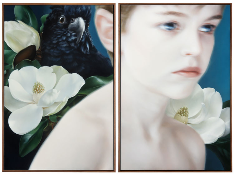
Over the last decade, Kantor has focused on creating work that layers art-historical references, among them works such as Manet’s A Bar at the Folies-Bergere, and Monet’s Les Mueles, for instance; and reproduction, be it photography, digital Internet imagery, or X-rays; along with various stylistic allusions, from the minimalist grid and monochromatic color to the pared-down approach of Luc Tuymans, mixing them all together with an acute awareness of the object-hood of art. In recognition of his practice, in 2008, he received a SECA award from SFMOMA and was included in the 2008 California Biennial, at OCMA.

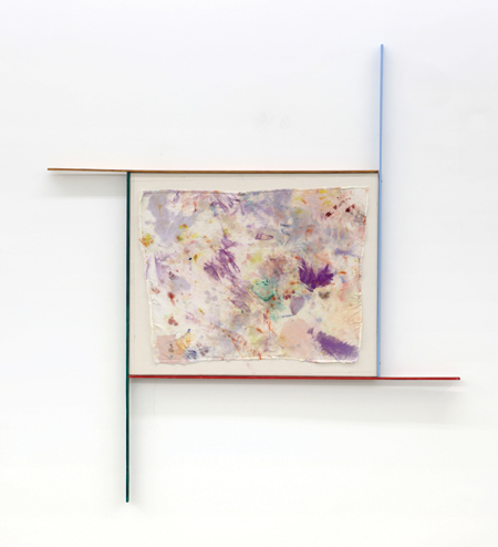
Given the vast and multifaceted background Kantor pulls from, the resulting body of work may appear incongruous to an unsuspecting viewer. “You might walk into a show of mine,” Kantor states, “and it might look like a group show, with works with so many different approaches and aesthetics. That’s because the unitary element of my practice isn’t aesthetics, it’s concepts.” One consequence of his art being so steeped in concept and the art world dialogue is that the work, by Kantor’s own admission, has required some background knowledge to be fully understood and appreciated. This is something the artist is veering away from in his current work, which explores the artistic value of materials and objects surrounding the art-making process; can, for instance, the rags used to wipe his paintings be configured into artwork in their own right?

For his recent solo show at Ratio 3 in San Francisco (January 11 through February 9), then, Kantor crafted “a large group, at least ten, of the rag paintings, in four-color, hand-painted artist frames,” he says. Additionally, he crafted “a suite of ten small representational paintings based on photographs of a woman’s hand in front of differently colored monochromatic fabric and a small group of large abstract works painted on wooden lattice.”

“Now the work is what it is,” he explains, “a display of materials. If you want to pick at it, you can tease out the thoughts that come from art history, but I don’t see that as being a prerequisite to having access to my work. It’s an open-ended process. I’m more interested in asking questions than arriving at answers.” This act of creating a dialogue strikes to the heart of what has driven Kantor since the beginning: “I see the whole process of being an artist as a way of engaging in a conversation across time,” he says, “sometimes with historical figures and sometimes with my peers and sometimes with people I don’t even know.”

Driss Ouadahi, "Breakthrough," 2012, oil on canvas, 78 3/4" x 141 3/4"

Driss Ouadahi, “Breakthrough,” 2012, oil on canvas, 78 3/4″ x 141 3/4″

“Look Both Ways”  features 31 works by 20 artists, including a large installation, several sizable sculptures and wall-works, as well as a number of moderately sized works. It also introduces Hosfelt Gallery’s grand new space — a light-filled, high-ceilinged, industrial-raw space encompassing 8,900 square feet — in the Potrero Hill area of San Francisco. The exhibition is a sampling of highlights from an illustrious stable artists: Alan Rath, Jay DeFeo, Tim Hawkinson, and Jim Campbell among them. And not only does it celebrate what’s transpired over the gallery’s 15-year history but also, with the introduction of several new artists as well as new work by long-standing artists, looks forward.

One highlight of the show is that several of the larger works – including Liliana Porter’s installation “Man with Axe,” the mechanized sculpture “Lala Zaza” by Rath, and Hawkinson’s whimsical “The Fin Within” – are to their benefit provided ample room to breathe in the expansive gallery space. And while there are works in a number of different mediums — mechanical sculpture, paintings, drawings, photography — and varied formal orientations — bright, subdued, detailed, minimal, organic, reflective — it all manages to hang together, a nod to good curating.

On the note of curating, and further addressing the space of the gallery, one of the stated goals of the exhibition is to present “work that exists on one level when seen from a distance, but that is something else up close.” There are several instances where this is particularly evident, one of which is Campbell’s light sculpture “Tilted View.” From afar, it’s a suspended plane of small, white globes, with shadows of what could be overhead clouds creating subtly greyed areas that float across their surface. Step in closer and the orbs break down into their individual units, each one hanging from a black wire. The illusion of the changing skycap is, it turns out, programmed patterns of light fed into small bulbs. The image has been pixilated, albeit it is no less lyrical for knowing that.

Emil Lukas’s elaborate wall-hung “Horizontal Ring” reads at a distance as a colorful abstract image that shifts as you move around it. The fine and innumerable pieces of thread that comprise the piece become evident as you get closer; they are strung from nails tacked into the sides of the frame, akin to the string art we were all introduced to in childhood, though taken to a whole new level of intricacy and layering. The effects are delightfully dizzying and dynamic.

Also by design, another common thread here is an emphasis on a visual hook to draw us in only to slowly reveal a greater depth. While the works throughout the show are consistently engaging, there are a few that stand out, particularly in this regard.

The breathtaking oil-on-canvas diptych “Breakthrough,” by Driss Ouadahi, features a broken chain-link fence with only sky behind it, here a purple and yellow sunset. This photorealistic work makes an immediate impact: it’s expansive, all-encompassing, and gorgeous. Sit with it for awhile and thoughts of imprisonment, escape, longing, and “it’s better on the other side” readily come to mind; then the patterns of the fence take on a meditative quality, disrupted by the snared imperfections.

While it’s easy to get wrapped up in the presence of the grander works, there are a number of modestly scaled pieces that hold their own: lively and colorful ink-and-acrylic on paper works by Rina Banerjee, simple yet poignant collages by John O’Reilly, and delicate monochromatic watercolors by Nicole P. Fein. It adds up to a celebration of thoughtful, complex work and a tantalizing foreshadowing of things to come.

Installation view of Clare Rojas's solo exhibition at SF Museum of Craft and Folk Art; courtesy SFMCFA

San Francisco neo-folk artist Clare Rojas expands her visual range in this pivotal show of new work, which dominates the intimate space of this small museum. This is a powerful, twistedly delightful exhibition. It further adds to the artist’s growing stature as one of the Bay Area’s most celebrated and prolific contemporary artists. In addition to this, her first solo museum show, Rojas’s work is also currently featured in a two-person exhibition with Barry McGee at the Bolinas Museum of Art, and, last April, the SF Arts Commission installed a commissioned work by her at the City’s international airport.
 
In keeping with past work, this show is bright and graphic. The flatness of the work references Rojas’s printmaking past; the influences of folk art, outsider art, street art, cartooning, illustration, and quilting remain strong. Rojas is rightly associated with the area’s “lowbrow” Mission School, which also encompasses artists McGee, Chris Johanson, and Margaret Kilgallen, among others. Comparisons among the artists can readily be drawn.
 
But Rojas is not simply a product of influences. Her voice, iconography, and message are distinctive and evolving. In this show, Rojas presents both smaller works, which are hung salon-style along one wall, and then numerous enormous works that cover the rest of the walls from floor to ceiling. Also on view is an amusing video, “Manipulation,” that Rojas contributed to with animation.
 
Throughout, the artist continues her references to home-life with figurative narratives that are often bizarre, verging on disturbing; a primary topic is gender/feminism. In one large-scale work, three women look to the sky, two expelling an upflowing substance from their mouths, the other from her eyes. In another, three male figures ascend a striped ramp/tongue that leads to a woman’s open mouth.
 
New here the artist also presents almost completely abstracted scenes, though references to the home remain; another larger-than-life piece is a minimalist home interior. Exploring formal uses of line, perspective, color, and composition, Rojas’s depiction of this comfort zone gets a little queasy. One high point of the exhibition is a huge “wall quilt” made up of numerous geometric panels, each painted one color, and arranged in a way that recalls childhood parquetry block designs; this surrounds a central seated female figure.
 
A critique that has been leveled at Rojas’ work is that it drifts toward decorative simplicity. Now, no. It has decorative elements that make it likable, just not too likeable. It pushes far beyond becoming vapid or ingratiating. Colors, shapes, and patterns clash in challenging, dissonant ways; there is a not-quite-right-ness that keeps us fully engaged. It is, indeed, the decorativeness that provides the hook; we stick around to feel the story.

In a 2004 New York Times review of Rojas’s solo show at Deitch Projects, critic Roberta Smith ended with the upbeat, “. . . this show generally brims with promise.” Clare Rojas is making good on that promise.

This review was originally published at Visual Art Source.

"Away" by Erin Cone

Even with fast and wide praise of her paintings since her first (sell-out) solo show in 2003, Santa Fe–based artist Erin Cone continues to push her work, and it shows. Cone boldly, consciously explores new approaches to form, composition, and palette with each body of work she creates. The recent solo exhibition at Hespe Gallery in San Francisco shows the painter refining and developing. 

Cone paints stylized figures based on herself. (These aren’t self-portraits, however; Cone acts as model, not subject). She says, accurately, that her work is a fusion of figurative realism and abstract minimalism. The figure is almost always solitary against a flat background and usually cropped in an arresting way—off to one side cutting out an arm, three-quarters of the head cut off. These works are as much about forms and arrangement as they are about the figure itself. And they are strong; this is made obvious when noting that the impact of the work isn’t diminished when showing the figure from behind, typically a less engaging view.

Numerous influences and art historical connections can be seen in Cone’s work. The clean, stylized approach of the neoclassicists, albeit with a fresh approach; Cone’s figure, dressed in “office casual,” is a modern woman. Contemporarily, there is a resemblance, especially as regards cropping and also stylization, to the Pasadena-based artist Kenton Nelson. Cone herself states influences from Georgia O’Keefe, Caravaggio, Édouard Manet, Gerhard Richter, and Wayne Thiebaud, among others. Cone’s traditional influences—she’d originally wanted to be a portrait painter in the Old Master style—are contrasted by the bold, commercial feel of graphic design and the slickness of photography. Her surfaces are clean and smooth, unblemished. (Cone worked as a graphic designer at a publishing company before taking the leap to devote herself to painting full time.) Inspiration also comes from collage, fashion, and dance.

For this body of work, Cone has limited her palette. She’s playing with levels of contrast. Some work features less, such as Away, a quiet work with almost a sepia tone appearance. Work such as Allure, showing a partial upper portion of a figure with a bright red shirt again a blue-grey ground, shows more. But gone are, say, the hard orange backgrounds of past work. The new-found subtlety is welcome. Cone also softens her images and adds movement by showing afterimages, hints of where the body just was; it gives us more to see. And the rendering of the figure itself, verging slightly more toward realism, gives these paintings greater life and depth; they energize the work more than in the past, and they’re simply better painted. If there are criticisms to be made, it’s that Cone’s work can tend toward being too pretty and too rigid or graphic—flat, lacking depth. Cone’s to be credited, however, for seriously honing her craft and working through formal concerns. It’s an exciting process to watch and no small pursuit.

 Here we see a dedicated, talented painter steadily developing into an artist.

This review first appeared on VisualArtSource.com.

"The Three Graces" by Lucy Gaylord-Lindholm

This review of Lucy Gaylord-Lindholm’s current solo exhibition recently appeared on Visual Art Source:

Enchanting, strange and impeccably painted, the series of new oil paintings by Bay Area artist Lucy Gaylord-Lindholm are wonderfully enticing, presenting a multi-layered universe that continues to unfold. The thirteen detailed works that comprise the exhibition are small, ranging in size from 17.5-by-13 inches to 11.5-by-9 inches. They are designed to create an intimate viewing experience.
A romantic evening landscape is intruded on by an enormous structure, or perhaps it is a creature made of haphazardly arranged pieces of lumber and fronted by the head of what appears to be a bird. Finely rendered portraits morph into a tangle of string. Gaylord-Lindholm’s paintings have a classic, centuries-old feel, drawing on traditional subjects and the genres of landscape, still life, portraiture, and the figure, with a heavy dose of surrealism.
In Three Graces the famous mythological trio is depicted nude and voluptuous in its traditional grouping. The middle figure faces away while the other two have their faces exposed to the viewer; here, however, the nudes are variously covered in larger-than-life Band-Aids – the adhesive strips appear on multiple occasions in this body of work. And, unlike most portrayals where the women interact only with each other, here the figure on the left, Aglaea, goddess of beauty, stares brazenly at the viewer, referencing the once-upon-a-time controversial frankness of Édouard Manet’s Olympia.
Gaylord-Lindholm draws ideas and imagery primarily from art history, pop culture, science, and fairy tales. “I’ve always been interested in the quirky or absurd,” the artist says in a recent interview, “portraying the impossible in a way that almost could be plausible.” From show to show, painting to painting, the imagery varies widely, but throughout, the palette is rich, the work tight and dramatic. And there is a commonly depicted idea: change, juxtaposing reality and the further reaches of our imagination, often drawing from a place of fear – disintegration of self, insanity, claustrophobia.
Untitled #2 is a portrait of a young girl, face forward, who stares into the middle ground, out toward us, but not at us. Her hair is dark brown and tied back, giving her a plain look; her clothing, which we see from the waist up, is a dark grey. She is against a solid darkish brown-green background. Below her neckline we can partially see through her to what’s beneath her skin: a small shadowy horse, mechanics, perhaps a spaceship. There is movement indicated toward the bottom and flowing to the right, as if a celestial storm is beginning to blow through her and will eventually fully expose her bizarre inner workings.
While these works are haunting, they are so gorgeously rendered and delightfully intricate, they play out like a dark comedy. And though completely odd, they have an internal logic that makes its own kind of sense; these paintings aren’t arbitrary. They approach the edge of absurdity without crossing over. We come away smiling and a bit more comfortable with the world’s uncertainty.

"Flock" by Amy Casey

See review of Amy Casey’s recent exhibition at Michael Rosenthal, San Francisco, in the current issue of art, ltd.