The Panama Pacific International Exhibition, San Francisco, 1915

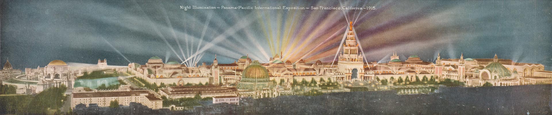
Just nine short years after the devastatingly destructive 1906 earthquake and subsequent fires, the citizens of San Francisco transformed the marshy wetlands of what is now the city’s prestigious Marina district, which had then been serving as a post-earthquake refugee camp, into the spectacular 1915 Panama-Pacific International Exposition (PPIE), a world’s fair to commemorate the opening of the Panama Canal. The feat was nothing short of miraculous.

The event featured 11 exhibition palaces over 635 acres, with 21 countries represented (in addition to national and more local representation). Central to the efforts of the fair was the showcasing of art. PPIE boasted one of the largest art exhibitions ever assembled in the United States: on show in the Bernard Maybeck–designed Palace of Fine Arts and an accompanying Annex were over 11,000 works of art (11,403, to be exact)—paintings, sculpture, prints, and photographs, all beautifully presented, as was discovered by the curatorial staff at the de Young when researching their upcoming exhibition celebrating the 100th anniversary of the PPIE. “We were excited to discover several previously unknown installation views of the Palace of Fine Arts,” says James A. Ganz, the de Young show’s curator. “There has always been an assumption that the Palace was a jumbled mess, but these photographs by Gabriel Moulin reveal beautifully installed galleries.”

Additionally, there were numerous murals and 1,500 sculptures commissioned by artists from around the world, as well as artwork that was part of other exhibitions in the fair. The total number of artworks at PPIE is estimated to be around 20,000. To help make sense of this overwhelming display, there was a strong art educational component, complete with docent tours. Unsurprisingly, there was a strong emphasis on American art, but also ample offerings from Europe, which was a major accomplishment given that, during the art acquisition phase, WWI broke out, making selection and shipping of the works enormously difficult. (Although in at least one case, the fair benefitted: 39 German paintings that had been shown in Pennsylvania and were scheduled to be returned didn’t make it back, due to the international turmoil, and ended up at the fair).

There was an emphasis in the show on Impressionism, but also examples of Austrian Expressionism, Hungarian modernism, and Italian Futurism; artists from Finland, France, and Italy, among other countries, were represented, some well-known, other not. For a majority of Bay Area residents (and those on the West Coast in general), it was their first time seeing not just what was happening artistically in Europe, but elsewhere in the United States.

In all, nearly 19 million people passed through the fair and roughly half of them visited the Palace of Fine Arts, which still stands today (the other structures were destroyed). From an art and culture perspective, PPIE had such impact that Ganz has dubbed it the “Great Artquake of San Francisco.” Tremors from this quake were felt long after the fair—and are still reverberating. The French Pavilion was the inspiration behind Alma Speckels’ museum, the Legion of Honor. The Palace of Fine Arts was turned into a museum. While that museum did close in 1924, the momentum of it (albeit not continuous) would eventually result in SFMOMA. The fine art component of what would become the Oakland Museum of California (a merger of three previously independent institutions) was launched. Many pieces from the fair found their way to Memorial Museum (now the de Young), which, prior to 1915, had been the only significant art museum in the city.

PPIE had an effect on artists as well, impacting the “Society of Six,” a group of innovative Oakland-based painters that emerged in 1917. Their works can be traced to the beginning of modernism in Northern California and would go on to influence, directly or indirectly, such artists as Richard Diebenkorn, David Park, and other members of the Bay Area figurative movement. Art buyers took advantage of the offerings as well: almost 1,600 pieces found homes outside the fair, with roughly 1,000 works staying in California, many of them ending up in public institutions.

To celebrate the centennial of the PPIE, numerous events and exhibitions are and will be taking place in the Bay Area throughout 2015, into 2016 (see ppie100.org), serving to demonstrate the monumentality of the fair and its enormous effect on the city. The California Historical Society is offering two exhibitions—at its downtown headquarters and at the Palace of Fine Arts—that provide an in-depth look into all aspects of the fair, including architecture and design.

Highlighting the fair’s fine art component is the highly anticipated de Young show “Jewel City: Art from San Francisco’s Panama-Pacific International Exposition” (opening October 17 and running through January 10, 2016). The show will feature over 200 works, most of which were shown at PPIE. Of particular note is the massive amount of research that went into creating the exhibition, the fruits of which are laid out in a thorough, copiously illustrated 400-page catalogue. “Until now, a clear understanding of the art historical significance of the PPIE has been obscured by its unwieldy scale… as well as the relative dearth of visual evidence of what was exhibited,” Ganz notes. “The contemporary catalogues and guidebooks of paintings, sculpture, prints, and photographs were sparsely illustrated, and few gallery interiors were photographed. The curatorial team spent several years scouring archival sources and the primary and secondary literature, as well as reaching out to auction houses, museums, and private collectors with the goal of identifying a critical mass of the works shown in 1915 to arrive at a considered and coherent selection for this restaging.”

By design, the selection of art will mirror the eclectic gathering featured at PPIE: “From the beginning I felt it was important that we should not merely assemble a group of masterpieces that have clearly stood the test of time,” Ganz states, “but that we ought to represent some of the prevailing artistic currents that include works of art by many figures who will be unfamiliar to today’s museumgoers. The curatorial challenge is to create a lucid and balanced exhibition that is true to the original experience of fairgoers in 1915. To that end, two-thirds of our show is devoted to American art, and one-third to the French Section and to the International Section.”

Of the many exceptional works that will be on show, Ganz points to a few highlights, including Umberto Boccioni’s Matter (1912), which, he states, “is a milestone of Italian Futurism.” Ganz also singles out Akseli Gallen-Kallela’s Symposium (The Problem) and Mäntykoski Waterfall: “I am especially pleased to be bringing these seminal works by this important Finnish painter back to San Francisco,” Ganz says. Among other artists whose work will be on view are American artists Mary Cassatt, James McNeill Whistler, and Thomas Eakins, and Europeans Claude Monet, Camille Pissarro and Oskar Kokoschka.

“Jewel City” will also show two large murals; these are of particular note because, “as original commissions for the PPIE,” says Ganz, “they are especially evocative of the exposition and the experience of fairgoers in 1915.” And finally, there will be documentation of the fair, including paintings and photographs. Among them is a photograph of the Palace of Fine Arts by then 13-year-old Ansel Adams (who skipped school for a year to regularly attend the fair). Together, these shows offer a unique opportunity to step back in time and experience the tremendous impact this one (albeit sprawling) event had on the San Francisco of 100 years ago, and today.

"Deep State," 2015, oil on canvas on panel, 84 x 72

“Deep State,” 2015, oil on canvas on panel, 84 x 72

Apocalyptic, trash-laden, desperate landscapes make up “Deep State,” a solo exhibition of new paintings and prints by Scott Greene. These narrative works — one can’t help but immediately begin to create the backstory that renders the worlds we’re looking at — are somewhat loosely painted, which adds to the sense of things falling apart, being oh so tentatively, just barely, held together.

The large, horizontal (144 x 48 inches) Trading Post features a cell tower camouflaged like a tall pine tree that’s leaned over (thus the horizontality of the work, which adds to its off-kilter feeling) and filled with supplies such as gas cans and animal pelts. A man toward the top of the “tree” is stashing wood and a lamb is falling to the ground. The rest of the landscape appears chaotic, disheveled.

Providing an element of comic relief to the serious subject of our compromised environment, which is the central focus of the show, is Cavalier, which depicted a Napoleon-like figure raising an arm up and forward, a sign that says, “Let us go forth and conquer!” He is astride a sheep, rather than a horse, and our Napoleon has a smiley-face plastic grocery bag stuck to his head, covering part of his face, and a large brown blanket covering his blue and gold uniform, which peaks out beneath. The sheep rears up, a surprised look on its bridled face, on a trash-strewn cliff overlooking the landscape below.

These works exemplify the feel of the show: the “advanced” world (wo)man has created or is attempting to create via technology or bravado and ambition comes with a cost. The natural world, which feeds us and makes our lives healthy and abundant, will ultimately deliver us back to times of primitive hunting and gathering and extreme filth, times we’re worked long and hard to advance from. Green environmentalist nightmare is that the world we take for granted will revert as a result of humanity’s hubris. These works depict an unpleasant yet possible future; they’re beautiful to the eye even, as a political statement, they mean to help sound a serious warning.

"A Consensual Hallucination," 2015, hand-cut collage on paper, 9.5" x 13.25"

“A Consensual Hallucination,” 2015, hand-cut collage on paper, 9.5″ x 13.25″

Collage artist Alexis Anne Mackenzie pushes her artistic practice to greater abstraction and complexity in relation to the work she presented less than a year ago. Comprised of small pieces, several of them diptychs, Mackenzie methodically cuts one or two images into strips — curved arches, straight verticals, and  wavy verticals — of roughly the same thickness and adheres these over another image at regular intervals that are the thickness of the strips. Thus, the images remain visible, albeit now variably stuttered, and with varying degrees of recognizability. For the diptychs, the same base image is used. One piece features a set of strips over the base. For the other she uses those that are left, such that the pieces strongly relate but also demonstrate how, given different sets of information from the same pictures, things can look vastly different.

The results are mesmerizing. The evenness of the repetition of the strips sets up a meditative rhythm. And movement is created by the vacillations of the strips, as well as the shape of the strips themselves (the works with the arched strips call to mind a record, which speaks to the artist’s avid interest in music). Then there is the intense visual engagement, as the eyes are compelled to continuously shift emphasis so as to pull out one image. A longer look reveals greater details in an individual image — flowers, female figures — and then, as the eye begins to bring into focus another of the images, the first image appears to fade, becoming almost ghostly. At times, the images all work together to form yet something else again. Mackenzie does an amazing job of playing forms from different images off of each other. While the concept at its heart, given the visual complexity, is relatively straightforward — it’s an interweaving of images — the resulting optical playground evocatively teases with ideas of how much to keep hidden and how much to reveal.

"Night Scented," 2014, oil on panel, 37" x 50" (dyptich)

“Night Scented,” 2014, oil on panel, 37″ x 50″ (dyptich)

San Francisco painter David Michael Smith presents another gorgeous, exceptionally well executed body of work that furthers his exploration of the relationship between humans and the natural world (on view through January 31). Primarily figurative and narrative, the works prominently feature one male or female figure, generally from the bust up. Ages vary from infant to young adult, but they share one commonality: they are all undeniably beautiful people. Additionally, the works feature flowers, often huge, and/or an animal, be it a black bird, a horse, or an ermine. And while at first glance these can appear as simply very pretty pictures, which indeed they are, they feature the tension of threat that lends them a subtle air of doom or danger: the flowers, based on those by the Dutch masters, loom large in the background, as if they might consume the subject. The black bird, which sits behind the shoulder of a young boy, has a powerful-looking hooked peak. The ermine’s sharp claws rest on the naked breasts of a woman.

Though the fauna and flora occupy the same visual space as the figures, there is a palpable disconnect — the attractive subjects are oblivious to the beauty that surrounds them. Further, they present an implied viewing angle, sometimes directed at the viewer, sometimes off to the distance, that evokes a feeling of disengagement. Unlike Smith’s previous bodies of work, which were all very precisely painted, a few of these pieces feature blurs and smears reminiscent of Gerhard Richter’s squeegee works. The effect provides a sense of movement, of time passing. Pushing his prodigious talents even further for this show, the artist sidles up to that sweetly evocative line of too precious, too lovely, without so obviously revealing why they’re not. All the while that the picture unfolds itself, the viewer has something sublime to look at.

"Bigger Trees Nearer Warter," winter 2008, oil on 9 canvases (36" x 48" each), 108" x 144"

“Bigger Trees Nearer Warter,” winter 2008, oil on 9 canvases (36″ x 48″ each), 108″ x 144″

“David Hockney really has been one of the most influential British artists of his generation,” says Richard Benefield, deputy director of the Fine Arts Museums of San Francisco (the umbrella organization for the de Young Museum and Legion of Honor). “In fact, he is arguably one of the most influential artists of his generation, period, because, even though he’s continued to work in a figurative style, he’s been open to exploring every possible technology that’s come his way.” Hockney is also, like the artist he most cherishes, Picasso, incredibly prolific. For these reasons, the de Young’s “David Hockney: A Bigger Exhibition” (October 26, 2013 – January 20, 2014), which covers Hockney’s career over the past decade (2002 to the present), will be the museum’s largest show ever. It features over 300 works (some of which were drying even as the final show list was being created), sprawling out over 18,000 square feet, 12,000 of that being the museum’s regular temporary exhibition space and the final 4,000 in four upstairs galleries.

Born in Bradford, United Kingdom, in 1937, Hockney, who splits his time between the countryside of his native England and Los Angeles, began garnering an increasing attention for his work in the late 1950s. At that time, as Benefield–who is also co-curator of the exhibition, with Gregory Evans–notes, the work was rather intellectual and verged on abstract. However, Hockney’s art has always maintained a connection to the figurative and has always exhibited the artist’s talent for drawing, an activity he’s pursued since childhood. Indeed, at the foundation of all his work, even the artist himself claims, is drawing and line.

As Sarah Howgate, contemporary curator of London’s National Portrait Gallery, notes in one of the catalog essays for the exhibition, “Hockney has always made exquisite line drawings; he is widely recognized as one of the greatest draftsmen of the second half of the twentieth century.”

As much as Hockney is revered for his talent in the most traditional of art mediums and pursuits–in addition to drawing, Hockney works in oils on canvas, as well as acrylics and, new for this exhibition, watercolor–he also fully embraces whatever new technology he can get his hands on. Additionally, he has long had a penchant for creating multiples, one interest that links him to the Pop art scene in which many have placed him, albeit that remains a sticking point for some. (Benefield, for instance, finds this comparison erroneous: “I don’t think he ever was a Pop artist,” Benefield states. “He just happened to come to prominence during the period of Pop Art, and he was very friendly with a number of Pop artists.”)

To these ends, Hockney created lithographs in the 1960s and 1970s. “He loved making prints,” notes Benefield, “because that was a way to disseminate his pictures to a larger audience.” From there he moved on to faxing drawings, then to creating high-quality printouts on a color photocopier, employing each technology when it was new. He’s also worked with photography and in Photoshop and now continually works with iPhones, iPads, and digital cameras–the latter three featuring prominently in this show (and he regularly sends his digital sketches to friends immediately upon completion); in fact, he’s replaced his ever-present sketchbook with an iPhone. But then, Benefield points out, he always returns to drawing and painting.

"Woldgate Woods, 30 March–21 April," oil on 6 canvases (36" x 48" each), 72" x 144"

“Woldgate Woods, 30 March–21 April,” oil on 6 canvases (36″ x 48″ each), 72″ x 144″

Hockney also sticks with tradition when it comes to the genres he focuses on; he only partakes of the three most historical art genre: still life, landscape, and portraiture. The latter two being what this current exhibition features, with equal weight given to both. However, to Hockney, all of his work has a figurative quality, even when figures are absent.

Fittingly, this exhibition covers a large range of mediums: charcoal on paper, multi-camera films, iPhone and iPad drawings (both printed out and on-screen), oil on canvas, acrylic on canvas, watercolor, and more. Generally, the exhibition is grouped by subject matter and medium: it begins with portraits, moves into plein-air landscapes, then film, and so on. “The exhibition will express his fluidity, how he flows easily between mediums,” explains Krista Brugnara, the director of exhibitions for the Fine Arts Museums of San Francisco. And that is because of Hockney’s ability to make each of his chosen modes of expression his own. To that point, Benefield says, “I never like to use the word experiment with Hockney because there never really is an experiment; he sort of goes through a period of, take the iPad for instance, he’s figuring out what all he’s able to do with it, and then he just all of a sudden has mastered it, and he’s creating phenomenal work on itÉ He picks it up, learns how to use it, masters it, and then starts making art with it.”

In addition to the exhibition featuring numerous mediums and a huge amount of work, another standout feature is that several of the works presented are the largest Hockney has ever made: in several instances, a single piece takes up an entire gallery. For example, The Arrival of Spring in Woldgate, East Yorkshire in 2011 (Twenty Eleven), Version 3, 2011Ð2013, which comprises 32 oil on canvas paintings and 12 iPad drawings each printed on 4 sheets of paper; Brugnara notes that the viewer “will be surrounded by what that [the arrival of spring] means.” In another gallery there will be playing four 18-camera films–what Hockney calls his cubist films–one on each wall, of the same location in Hockney’s home area of Woldgate Woods. Each wall features a different season, with each of the 18 cameras providing a slightly different perspective of the landscape: the viewer is thus engulfed in the full spectrum of a year. Notably, the viewer being immersed is part of the piece, thus making these large works implicitly figurative.

In the upstairs galleries, viewers will experience some of Hockney’s most recent works as well as a few older pieces, which provide context for the rest of the exhibition. Being shown for the first time is The Great Wall, a huge (72 feet long and eight feet high) presentation of chronologically and geographically ordered images presenting the history of European portraiture from 1200 to 1900. The work is the result of exhaustive research into the subject, leading up to Hockney’s somewhat controversial book “Secret Knowledge,” which concludes that the Old Masters used optical devices to map their works. Some of Hockney’s photo collages will also be on view, these relating to the cubist films and the multi-canvas landscapes, all being studies in perspective.

So, with an exhibition so enormous, what’s the best approach for the viewer? “I think that people have to come to the exhibition with an open mind and clear their heads of what they remember of Hockney as swimming pool paintingsÉ and let themselves be surprised.” Benefield says. But, he adds, “Prepare to be a little overwhelmed.” He continues, “There’s so much to see in all of this work, the generosity of the artist himself just putting it all out there for you to take it in.” Perhaps the greatest gift Hockney is presenting, again and again, is providing us with a new way of seeing: from different angles, at different times, in different forms. As amply evidenced in this vast exhibition, he’s abundantly offering the opportunity to look at the world with fresh eyes.

"Untitled (20A)," 2012, oil on cotton and pencil on canvas, oil on wood, 50" x 45"

“Untitled (20A),” 2012, oil on cotton and pencil on canvas, oil on wood, 50″ x 45″

From his earliest forays into the world of visual art, Jordan Kantor has inextricably linked art-making and art history. This dual interest has led Kantor down a path of academic rigor, curatorial studies, art teaching, and art writing–all of which informs Kantor’s strongest passion: being an artist. While still in high school, he started taking art history courses at the local university (Princeton). From there, Kantor went on earn a degree in painting at Stanford, where he developed, as a thesis project, an exhibition of prints by Albrecht Durer: “It was not so much a scholarly thing,” explains Kantor, “but more from a practical perspective, of my own interest in reproductive mediums, narratives, across a certain set of artworks.”

Kantor later pitched the thesis exhibition to Harvard, which led to a three-year curatorial project, and to Kantor earning his PhD there, in the history of art and architecture. Meanwhile, he also began to build a name for himself as an artist, having shows in New York, where he was living. “One of my goals was to get out of the studio and not just be in my own head,” he explains. “I was introduced to some people at Artforum magazine, and I decided I wanted to write reviews, in the tradition of artists who wrote, such as Donald Judd–who found a way to work out problems in their artistic practice through a writing practice.” He began writing regularly for Artforum, and to this day continues to publish articles on contemporary art. Kantor also further engaged in curatorial pursuits, working for two years as an assistant curator at MOMA. But his primary interest remained art making, so when the opportunity arose to move to San Francisco to teach at CCA and return to a full-time studio practice, Kantor made the move.

Over the last decade, Kantor has focused on creating work that layers art-historical references, among them works such as Manet’s A Bar at the Folies-Bergere, and Monet’s Les Mueles, for instance; and reproduction, be it photography, digital Internet imagery, or X-rays; along with various stylistic allusions, from the minimalist grid and monochromatic color to the pared-down approach of Luc Tuymans, mixing them all together with an acute awareness of the object-hood of art. In recognition of his practice, in 2008, he received a SECA award from SFMOMA and was included in the 2008 California Biennial, at OCMA.

Given the vast and multifaceted background Kantor pulls from, the resulting body of work may appear incongruous to an unsuspecting viewer. “You might walk into a show of mine,” Kantor states, “and it might look like a group show, with works with so many different approaches and aesthetics. That’s because the unitary element of my practice isn’t aesthetics, it’s concepts.” One consequence of his art being so steeped in concept and the art world dialogue is that the work, by Kantor’s own admission, has required some background knowledge to be fully understood and appreciated. This is something the artist is veering away from in his current work, which explores the artistic value of materials and objects surrounding the art-making process; can, for instance, the rags used to wipe his paintings be configured into artwork in their own right?

For his recent solo show at Ratio 3 in San Francisco (January 11 through February 9), then, Kantor crafted “a large group, at least ten, of the rag paintings, in four-color, hand-painted artist frames,” he says. Additionally, he crafted “a suite of ten small representational paintings based on photographs of a woman’s hand in front of differently colored monochromatic fabric and a small group of large abstract works painted on wooden lattice.”

“Now the work is what it is,” he explains, “a display of materials. If you want to pick at it, you can tease out the thoughts that come from art history, but I don’t see that as being a prerequisite to having access to my work. It’s an open-ended process. I’m more interested in asking questions than arriving at answers.” This act of creating a dialogue strikes to the heart of what has driven Kantor since the beginning: “I see the whole process of being an artist as a way of engaging in a conversation across time,” he says, “sometimes with historical figures and sometimes with my peers and sometimes with people I don’t even know.”

Driss Ouadahi, "Breakthrough," 2012, oil on canvas, 78 3/4" x 141 3/4"

Driss Ouadahi, “Breakthrough,” 2012, oil on canvas, 78 3/4″ x 141 3/4″

“Look Both Ways”  features 31 works by 20 artists, including a large installation, several sizable sculptures and wall-works, as well as a number of moderately sized works. It also introduces Hosfelt Gallery’s grand new space — a light-filled, high-ceilinged, industrial-raw space encompassing 8,900 square feet — in the Potrero Hill area of San Francisco. The exhibition is a sampling of highlights from an illustrious stable artists: Alan Rath, Jay DeFeo, Tim Hawkinson, and Jim Campbell among them. And not only does it celebrate what’s transpired over the gallery’s 15-year history but also, with the introduction of several new artists as well as new work by long-standing artists, looks forward.

One highlight of the show is that several of the larger works – including Liliana Porter’s installation “Man with Axe,” the mechanized sculpture “Lala Zaza” by Rath, and Hawkinson’s whimsical “The Fin Within” – are to their benefit provided ample room to breathe in the expansive gallery space. And while there are works in a number of different mediums — mechanical sculpture, paintings, drawings, photography — and varied formal orientations — bright, subdued, detailed, minimal, organic, reflective — it all manages to hang together, a nod to good curating.

On the note of curating, and further addressing the space of the gallery, one of the stated goals of the exhibition is to present “work that exists on one level when seen from a distance, but that is something else up close.” There are several instances where this is particularly evident, one of which is Campbell’s light sculpture “Tilted View.” From afar, it’s a suspended plane of small, white globes, with shadows of what could be overhead clouds creating subtly greyed areas that float across their surface. Step in closer and the orbs break down into their individual units, each one hanging from a black wire. The illusion of the changing skycap is, it turns out, programmed patterns of light fed into small bulbs. The image has been pixilated, albeit it is no less lyrical for knowing that.

Emil Lukas’s elaborate wall-hung “Horizontal Ring” reads at a distance as a colorful abstract image that shifts as you move around it. The fine and innumerable pieces of thread that comprise the piece become evident as you get closer; they are strung from nails tacked into the sides of the frame, akin to the string art we were all introduced to in childhood, though taken to a whole new level of intricacy and layering. The effects are delightfully dizzying and dynamic.

Also by design, another common thread here is an emphasis on a visual hook to draw us in only to slowly reveal a greater depth. While the works throughout the show are consistently engaging, there are a few that stand out, particularly in this regard.

The breathtaking oil-on-canvas diptych “Breakthrough,” by Driss Ouadahi, features a broken chain-link fence with only sky behind it, here a purple and yellow sunset. This photorealistic work makes an immediate impact: it’s expansive, all-encompassing, and gorgeous. Sit with it for awhile and thoughts of imprisonment, escape, longing, and “it’s better on the other side” readily come to mind; then the patterns of the fence take on a meditative quality, disrupted by the snared imperfections.

While it’s easy to get wrapped up in the presence of the grander works, there are a number of modestly scaled pieces that hold their own: lively and colorful ink-and-acrylic on paper works by Rina Banerjee, simple yet poignant collages by John O’Reilly, and delicate monochromatic watercolors by Nicole P. Fein. It adds up to a celebration of thoughtful, complex work and a tantalizing foreshadowing of things to come.

Ever since Bay Area painter Nellie King Solomon had her first solo show in San Francisco fresh out of graduate school in 2001, her work has met with positive reviews, even from the hard-to-please SF Chronicle art critic Kenneth Baker. (She’s also a three-time SECA nominee, up again for the award this year.) The final words of his glowing appraisal of that first show also issued up a challenge that many shared: “Her show is a powerful debut that will be hard for her to follow.” Solomon laughs about the gauntlet Baker threw. Her reaction? “I was like, you do not know who you’re messing with.” Almost a decade later, the work is stronger than ever.

As Is, 2001, by Nellie King Solomon; courtesy Nellie King Solomon

Solomon makes luscious, ephemeral large-scale abstract paintings on Mylar, addressing issues of space and environment, control and movement. They are created in her light-filled Hunter’s Point studio, on a table using handmade tools or sometimes just gravity to maneuver the paint. The imperfect surface contributes to the creation. Her early works were bright and fluid; puddles and rivulets meandered over the opaque surface resulting in meditative, organic paintings. On some, oval marks stamped with one of her homemade wooden tools, are also evident, harkening back to the point at which Solomon started her artistic journey–with the dot.

Solomon’s path to painting was indirect. Raised in San Francisco by an architect father and philosopher/dancer/writer mother, she’s known the creative life since birth. But it wasn’t clear until she’d already pursued several different avenues, including sustainable agriculture and architecture, that painting would be her primary focus. The decision to pursue art–Solomon earned a master’s of fine arts degree from California College of the Arts–coincided with a shift in momentum. “The reason for the dot was to stop traveling. Every two years I would leave some city and move to another. I needed to stop. The line, which was architecture, was also travel; so I took it away. I was in dots for four years before I touched representation and then another four years before I touched color. Then it moved to these ovals because I wanted a little bit of speed, but I still wanted it to stay slow.”

Niagara, 2000, by Nellie King Solomon; courtesy Nellie King Solomon

With this new work, Solomon is beginning to move. Whereas past paintings were almost self-created by the undulations of her work surface, in these, Solomon is the primary guiding force. A common feature throughout are large, thick rings that don’t quite close; the shape is created with a graceful full-body gesture, a nod to Solomon’s early training as a dancer. “I have hidden that strong arm behind my back for a long time,” she explains. “I’m just letting it come out. That’s one reason I work so large. I want it to be to some degree out of my control. If it’s too big for me to be able to handle, it keeps me from getting glib. It keeps me a little scared.” Solomon’s increased boldness is also evident in her changing palette. Pretty pinks, reds, and yellows of the past are replaced by toxic neon oranges and magentas and dark browns, black, green, and blue mixed with glitter; the edges, caked with soda-ash, have a corroded texture. The influence of Solomon’s interest in the environment, and the increasing degradation of it, is increasingly obvious. Gone are the delicate niceties of early work; these paintings are brave, brazen, and intense.

Boom Bloom, 2008, by Nellie King Solomon; courtesy Brian Gross Fine Art

“I always knew I had something to say,” says Solomon, reflecting back over her career to date. “I just didn’t know what I was going to say. But I knew that nobody was going to do it if I didn’t. I feel like I’m just getting started.”

Installation view of Clare Rojas's solo exhibition at SF Museum of Craft and Folk Art; courtesy SFMCFA

San Francisco neo-folk artist Clare Rojas expands her visual range in this pivotal show of new work, which dominates the intimate space of this small museum. This is a powerful, twistedly delightful exhibition. It further adds to the artist’s growing stature as one of the Bay Area’s most celebrated and prolific contemporary artists. In addition to this, her first solo museum show, Rojas’s work is also currently featured in a two-person exhibition with Barry McGee at the Bolinas Museum of Art, and, last April, the SF Arts Commission installed a commissioned work by her at the City’s international airport.
 
In keeping with past work, this show is bright and graphic. The flatness of the work references Rojas’s printmaking past; the influences of folk art, outsider art, street art, cartooning, illustration, and quilting remain strong. Rojas is rightly associated with the area’s “lowbrow” Mission School, which also encompasses artists McGee, Chris Johanson, and Margaret Kilgallen, among others. Comparisons among the artists can readily be drawn.
 
But Rojas is not simply a product of influences. Her voice, iconography, and message are distinctive and evolving. In this show, Rojas presents both smaller works, which are hung salon-style along one wall, and then numerous enormous works that cover the rest of the walls from floor to ceiling. Also on view is an amusing video, “Manipulation,” that Rojas contributed to with animation.
 
Throughout, the artist continues her references to home-life with figurative narratives that are often bizarre, verging on disturbing; a primary topic is gender/feminism. In one large-scale work, three women look to the sky, two expelling an upflowing substance from their mouths, the other from her eyes. In another, three male figures ascend a striped ramp/tongue that leads to a woman’s open mouth.
 
New here the artist also presents almost completely abstracted scenes, though references to the home remain; another larger-than-life piece is a minimalist home interior. Exploring formal uses of line, perspective, color, and composition, Rojas’s depiction of this comfort zone gets a little queasy. One high point of the exhibition is a huge “wall quilt” made up of numerous geometric panels, each painted one color, and arranged in a way that recalls childhood parquetry block designs; this surrounds a central seated female figure.
 
A critique that has been leveled at Rojas’ work is that it drifts toward decorative simplicity. Now, no. It has decorative elements that make it likable, just not too likeable. It pushes far beyond becoming vapid or ingratiating. Colors, shapes, and patterns clash in challenging, dissonant ways; there is a not-quite-right-ness that keeps us fully engaged. It is, indeed, the decorativeness that provides the hook; we stick around to feel the story.

In a 2004 New York Times review of Rojas’s solo show at Deitch Projects, critic Roberta Smith ended with the upbeat, “. . . this show generally brims with promise.” Clare Rojas is making good on that promise.

This review was originally published at Visual Art Source.

Four galleries in San Francisco have teamed up and given curatorial freedom and unlimited access to their racks to four artists tasked to create one four-part group exhibition. This superb mega-show is called: “They Knew What They Wanted”. And it’s a rare change-up to the typically less inspiring multi-artist shows that occupy gallery space during this, the art world’s slow season. It’s also helping to bring together the city’s ever burgeoning art scene.

Detail of show curated by Katy Grannan at Fraenkel Gallery; courtesy Fraenkel Gallery

Roughly a year ago, Jeffrey Fraenkel, owner of his eponymous and highly regarded photography gallery, dreamed up the idea of a collaborative summer project involving other galleries. He teamed up with internationally renown Berggruen Gallery and two newer, highly contemporary galleries, Ratio 3 and Altman Siegel and developed “They Knew What They Wanted.” The show spans all four spaces. Each gallery’s part is curated by one of their own artists — Robert Bechtle for Berggruen, Katy Grannan for Fraenkel, Jordan Kantor for Ratio 3, and Shannon Ebner (the only non-SF artist; she’s from L.A.) for Altman Siegel.

DETAIL of show curated by Jordan Kantor at Ratio 3; courtesy Ratio 3

“This truly was a collaborative effort,” says Frish Brandt, director of Fraenkel. She also notes that this was a case study in gallery cross-pollination, as a means to strengthen the area’s visual art community and relationships among galleries. Quoting a favorite borrowed phrase, she says, “I’ve always said, ‘It takes a village.'” So successful has this project been, both from a planning as well as a results standpoint, Brandt notes that there is interest in future collaborations.

I’ll admit, when I first learned about this show, I thought it might suffer from being gimmicky, too hip and clever. I was wrong. After I saw the first show, I couldn’t wait to see the second. My enthusiasm only increased as I made my way to galleries three and four. One of the original show titles was something along the lines of “Treasure Hunt.” While I’m happy that got nixed, it does rightly point to the searching, journey, discovery elements of this project.

From gallery to gallery, there’s the joy of finding stellar not often or rarely seen pictures and sculptures from artists famous, emerging, and little or unknown — and spanning a large swath of time — such as: anonymous, E.J. Bellocq, Vija Celmins, Lee Friedlander, Adam Fuss, Maureen Gallace, Edward Muybridge, Trevor Plagen, Ed Ruscha, Rachel Whiteread, Sara Vanderbeek, Bernd and Hilla Becher, Charlie Harper, Matt Keegan, Los Carpinteros, Henry Wessel, Barry McGee, Tom McKinley, Manuel Neri, Mitzi Pederson, Robert Rauschenberg, Will Rogan, Iran Do Espirito Santo, Garth Weiser, and others, including the artist/curators themselves.

The installments are further enhanced by unique curating, expressing the individual personalities or creative investigations of the artists. “It’s as much about the artists as it is about the shows,” observes Brandt. We’re also reminded the role curating plays in how art is perceived; new context provides a fresh take — the experience of an artwork is always partially a product of the environment. “Everything has its absolute right place in relationship to itself and the work that it is in proximity to,” says Ebner on this subject. “Each artwork possesses a universe and so determining where it belongs in relationship to all of the other universes around it is a very satisfying problem.”

Painting from show curated by Robert Bechtle at Berggruen Gallery, Tom McKinley, Pool House, 2008, courtesy Berggruen Gallery

So, puzzling through the curatorial dynamic of each show presents another layer of pleasures. At Freankel, Grannan presents clumps of coherence that play off each other in strangely humorous ways. “It’s ineffable,” observes Brandt about Grannan’s chapter. “It has a certain energy – -messy and chaotic.” An energy akin to that of the subjects in the photographs Grannan makes. Similar rhythm can be found in Kantor’s contribution. He started with key works and built small groups around each. The show holds together with a subtle narrative that one feels rather than tells; Kantor attributes that cohesion to the fact that all of the works were ones that appeal to his taste. More directly emulating his artistic style, Bechtle’s show features almost exclusively landscape, many depicting everyday life. “I included many artists who I admire,” he says, “and added others I wasn’t familiar with.” Much of the curating process was intuitive, by the seat of his pants, he says.

Ebner’s creation has the feel of a singular installation. “I did not really set out with too much criteria,” she explains, “but more of a vague sense that I wanted the works selected for the show to possess a kind of quality or affect.

Sculpture from show curated by Shannon Ebner at Alman Siegel, Iran Do Espirito Santo, Water Glass 2, courtesy Altman Siegel, SF

“I was looking to see if there are ways to select and juxtapose artworks so that what they mean or say or do as a fixed identity is constantly being called into question,” Ebner continues. “A good example of this might be Iran’s water glass [Iran Do Espirito Santo’s Water Glass 2] and how, because it is a solid form made of crystal, it creates the illusion that it is a liquid, a glass always full. When you take a liquid and make it a solid, but still have it appear as what we expect it to be, you are really asking us to think about all of reality as a series of inquiries and/or doubts.”

“They Knew What They Wanted” is like great summer reading. Fun, liberating, and with just the right amount of depth and momentum; you not want to stop until you reach the end. It also leaves you hoping that there will be a new release next summer.

Detail of show curated by Shannon Ebner at Altman Siegel, courtesy Altman Siegel, SF

This exhibition closes August 13.